Bringing editorial to Bandcamp’s Front Page
Filed under UX/UI, Art Direction, Project Management, User Testing
What were we doing, and why?
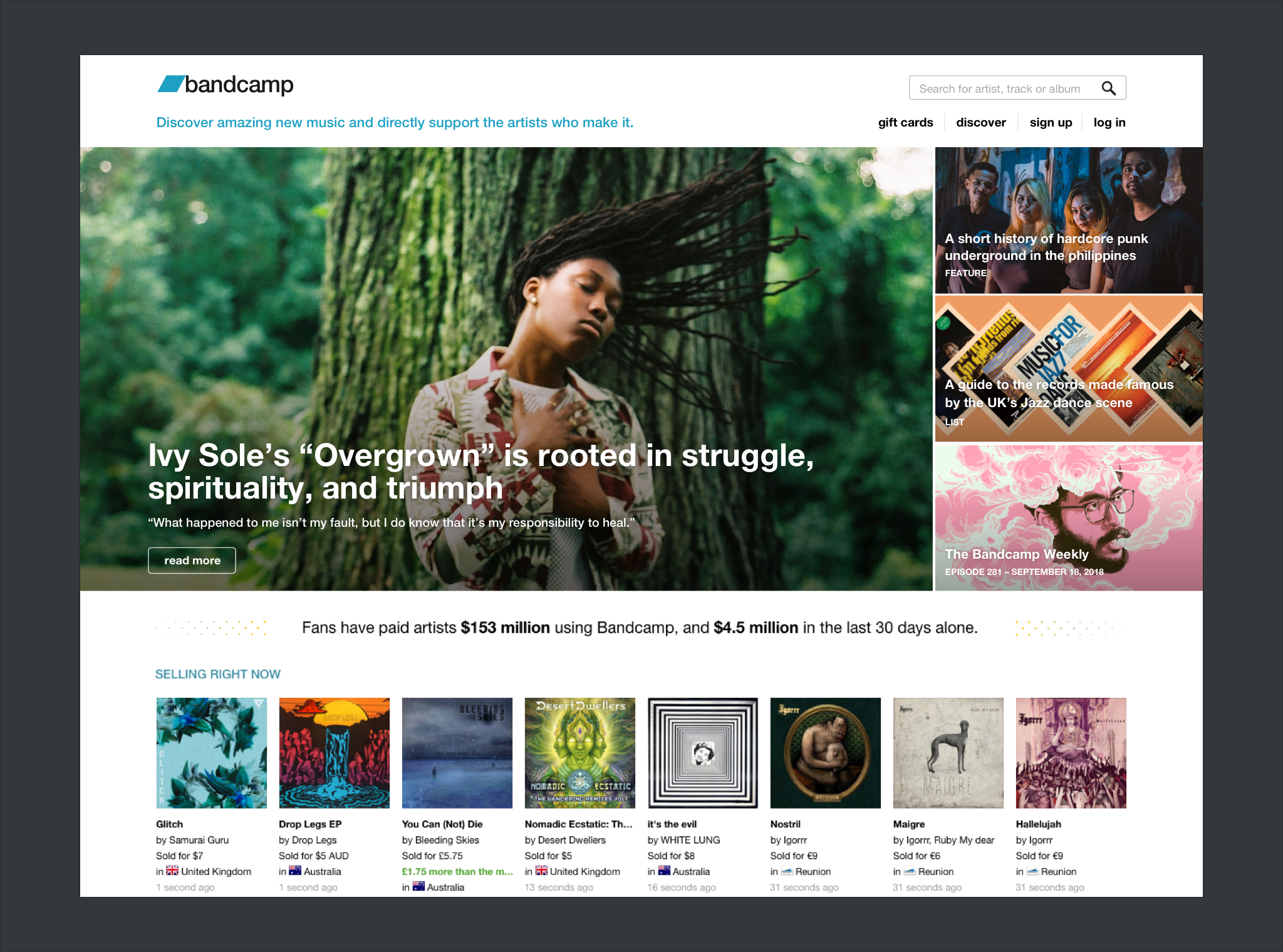
It was 2016, and our brand new editorial team was launching the Daily, Bandcamp’s own independent music publication. The mission was to shed a light on the diverse world of Bandcamp’s artists, guiding fans through “one of the greatest underground-culture bazaars of our time”.
Up until the Daily was born, the homepage represented Bandcamp’s main display window. With more than 600,000 artist sites, the homepage has been the compass of Bandcamp’s music discovery, tipping fans on where to look for interesting stuff. Now that the Daily would be taking the lead in curating recommendations, it had to find its place on the homepage. Bandcamp’s home was due for a revamp.
What was I asked to do?
- Redesign the top half of our homepage to fit a showcase of the Daily’s features.
- Design the flow for populating the homepage with editorial’s content.
- Design the internal dashboard to manage the homepage content.
Homepage Redesign
Old Home, New Plan
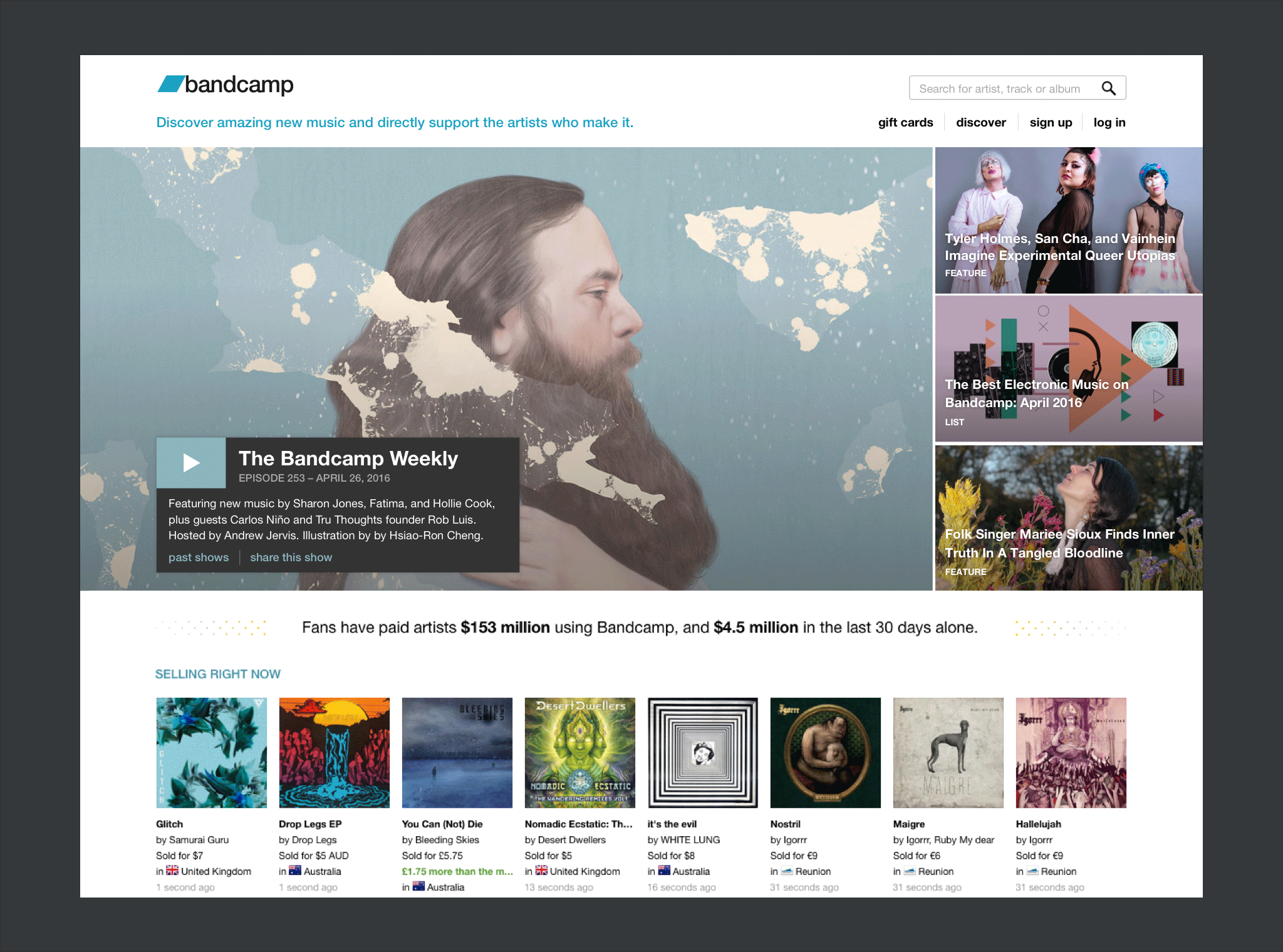
By the time I got assigned the redesign, Bandcamp’s homepage was divided in to 7 sections, and a footer. The upper sections of the page were dedicated to music discovery, opening with a large full-width banner hosting the latest episode of our radio show, The Bandcamp Weekly. Below there was a combination of smaller sections, offering different ways to browse, filter, and dig to find them music gems they’ve been looking for. With an emphsais on user conversion through purchasing, the CTAs for sign up were considered secondary to music discovery, and lined up at the very bottom of the page.
Step One, Hero Banner
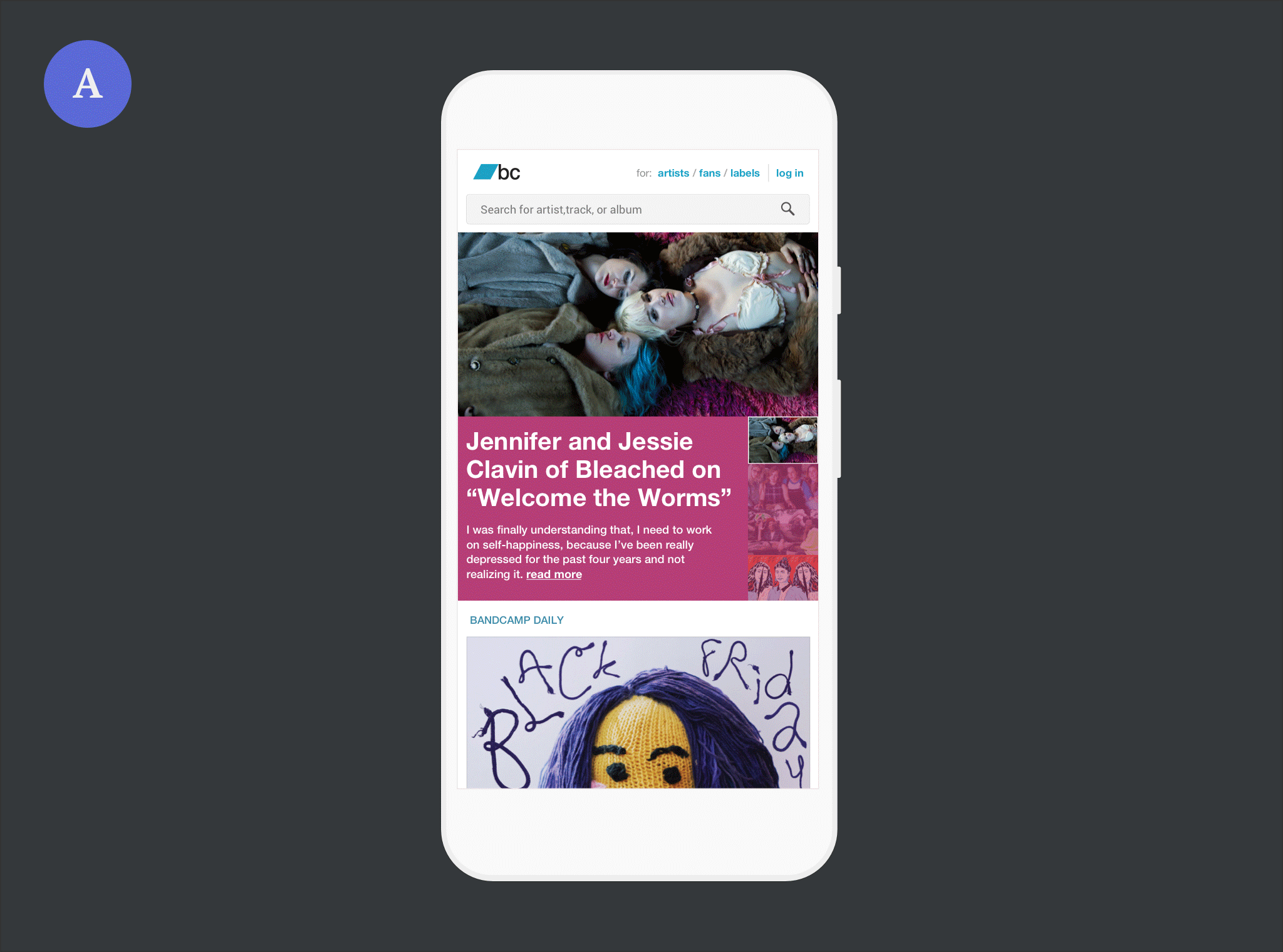
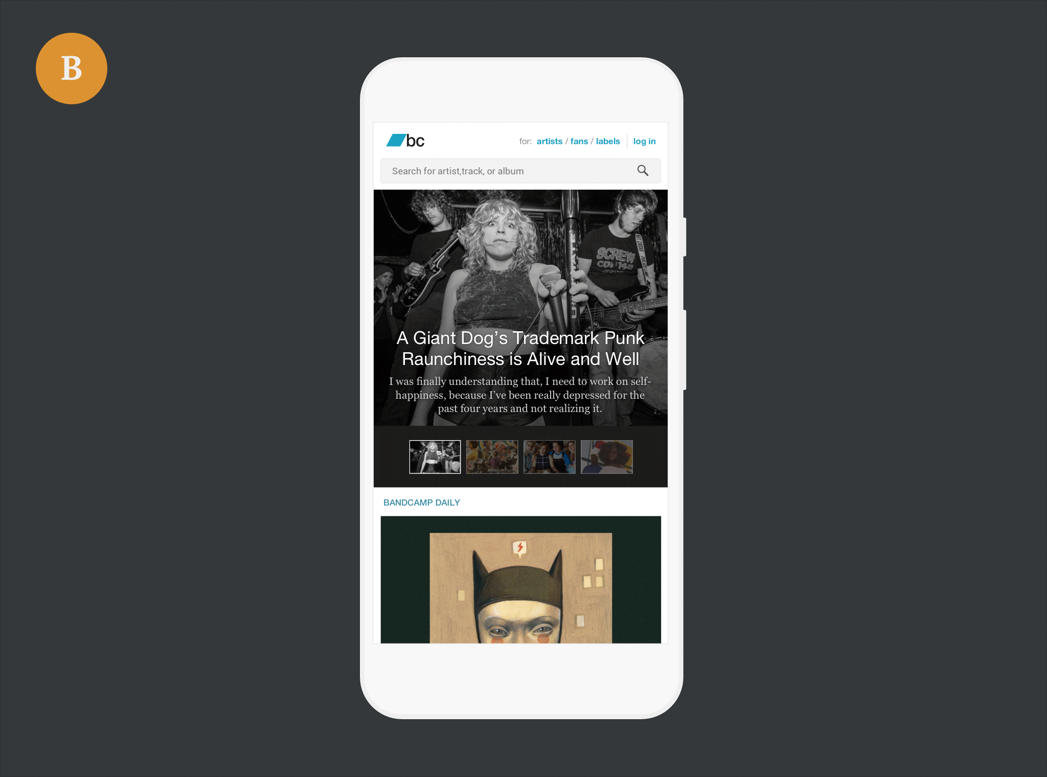
Before anything, I worked on the full-width banner to repurpose it. From the brief, it was to fit three or more Daily headlines, and the current Weekly episode. I started playing with big headlines on flat-coloured backgrounds, animated slideshows, and tiled grids. We called this module the carousel. My soft spot was for galleries with bright colours and full blown photographs, but considering mobile web performance we opted for a static carousel.
Below: rejected early proposals. The layouts were balanced and catchy, but we wanted to present all the content at once, also avoiding performance issues. – click on the images to enlarge
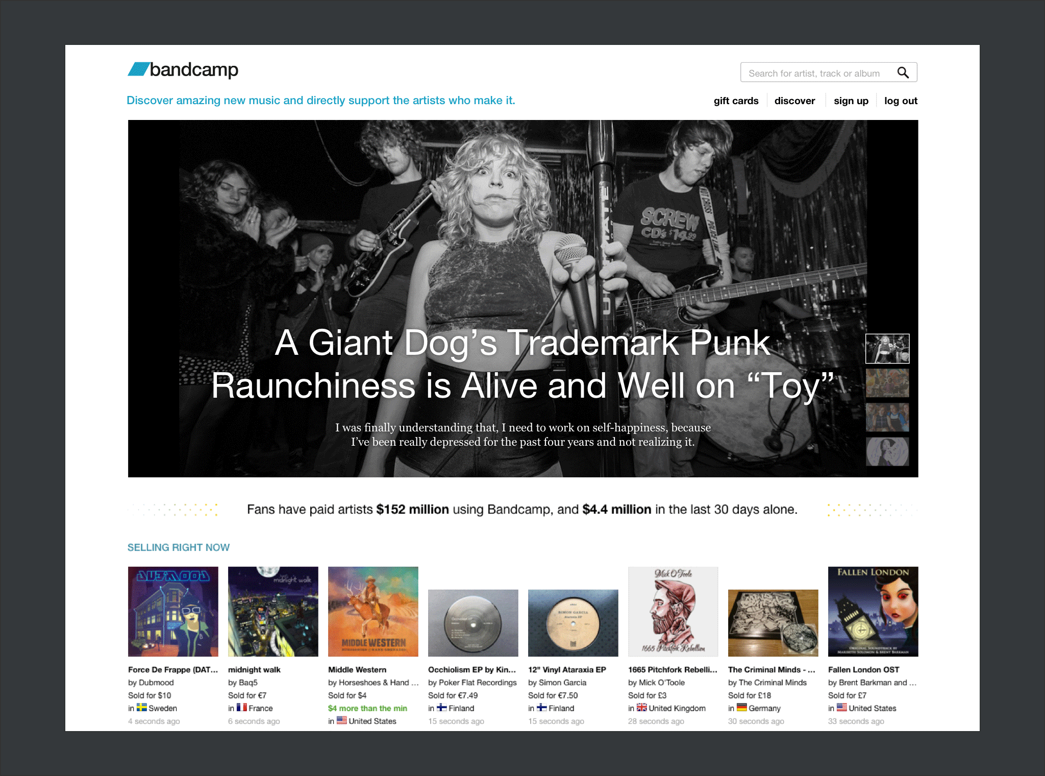
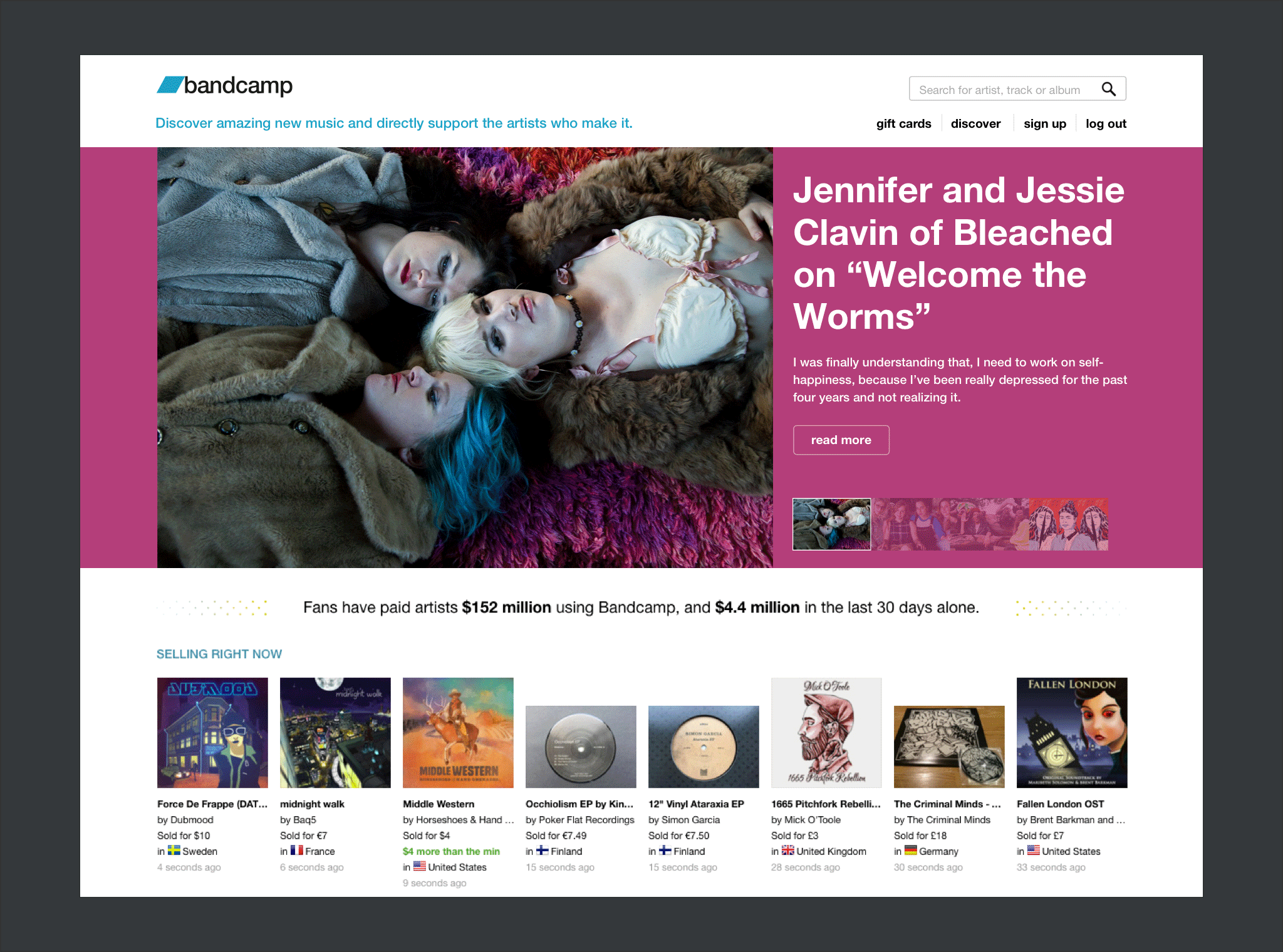
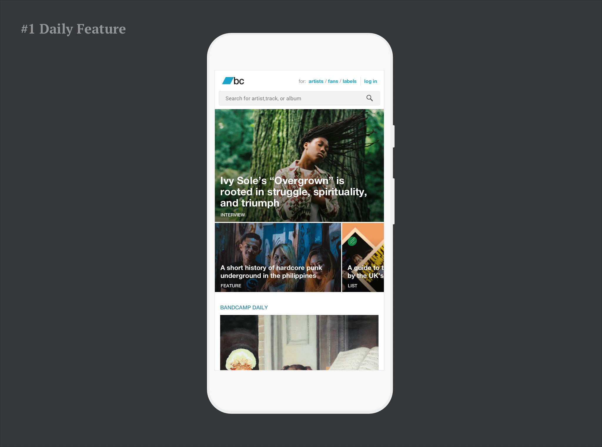
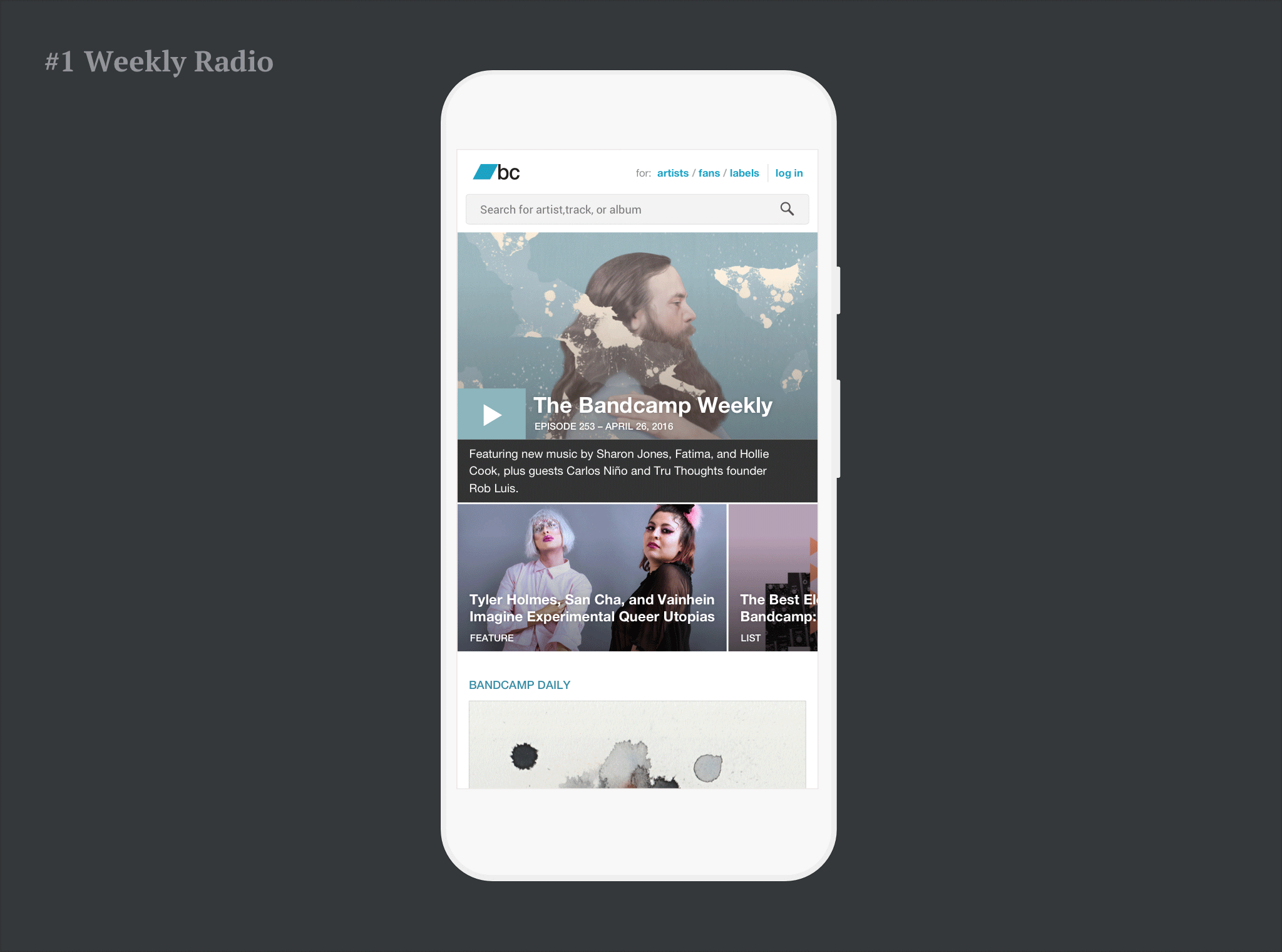
The proposal that made the cut had no slideshow, with images arranged in a tiled layout. The mobile version used a nifty swiping pattern to scroll secondary headlines, maximizing the horizontal space with a catchy gesture.
Not only a matter of performance. This layout better supports highlighting an individual story. On the left: mobile web and desktop when a _Daily_ articles is highlighted. On the right: Weekly radio episode taking over the main spot. Clicking the play button, the tile grows to full width and the title card expands into a player.
Step Two, Recent Stories Cards
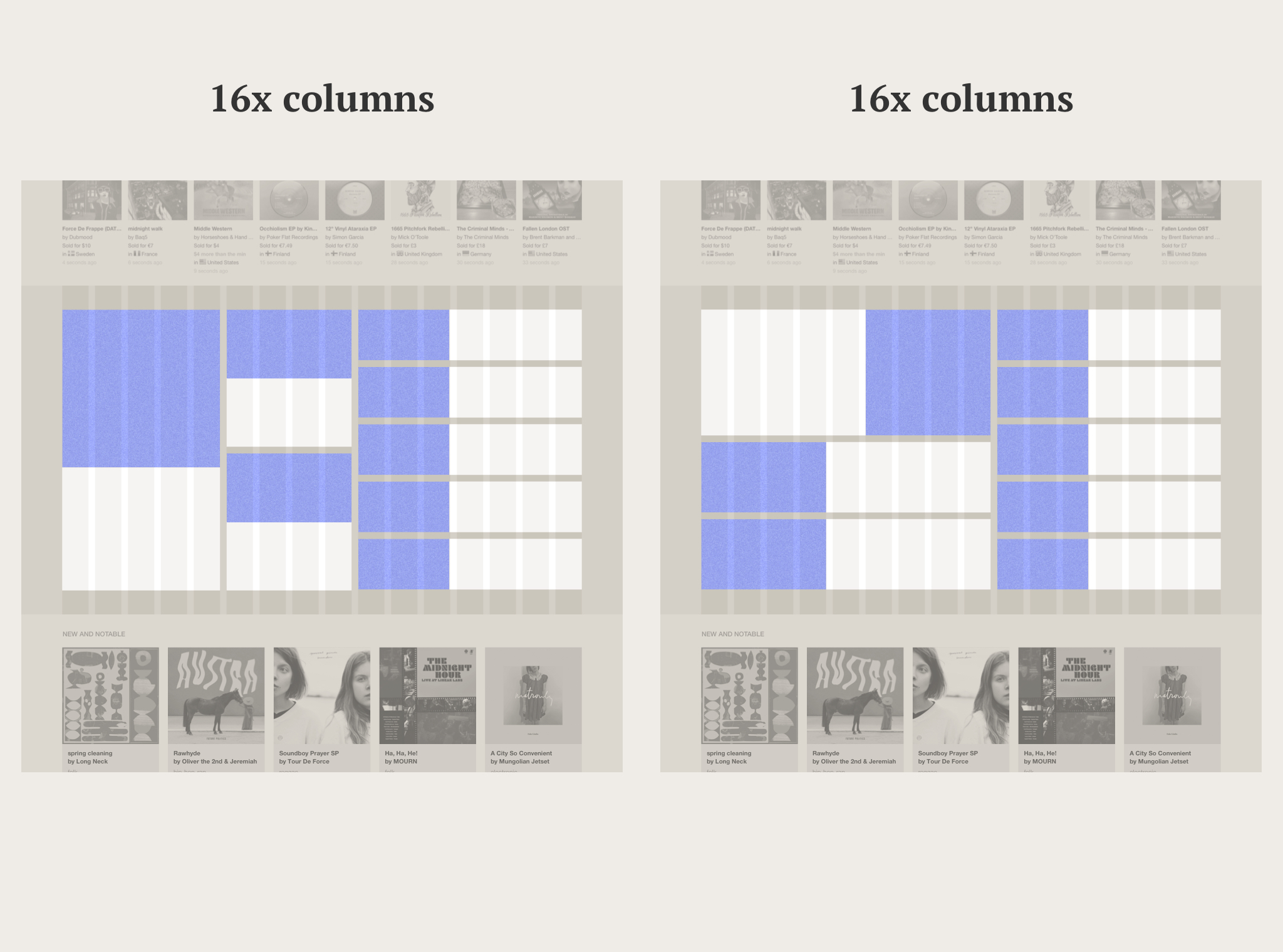
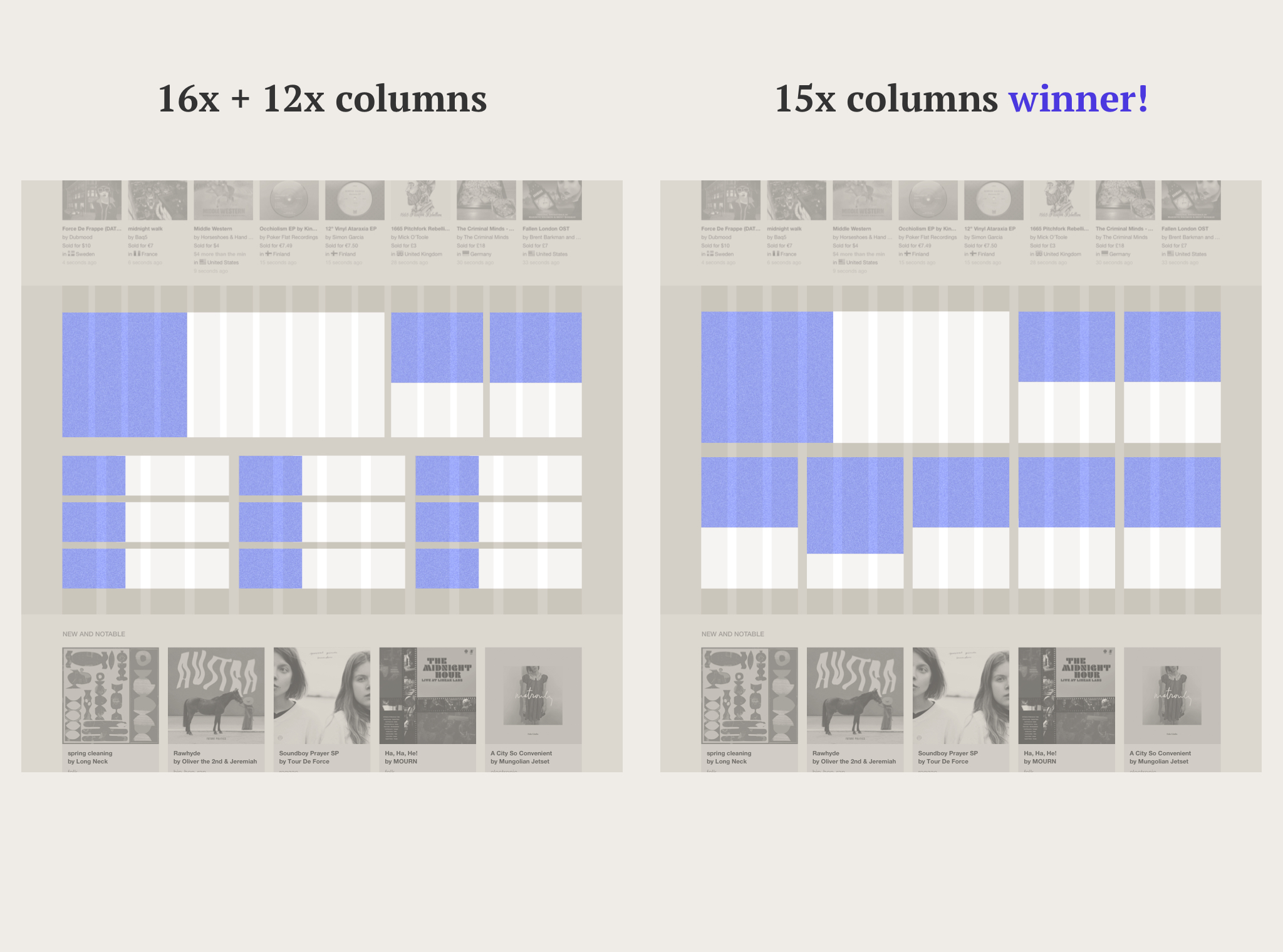
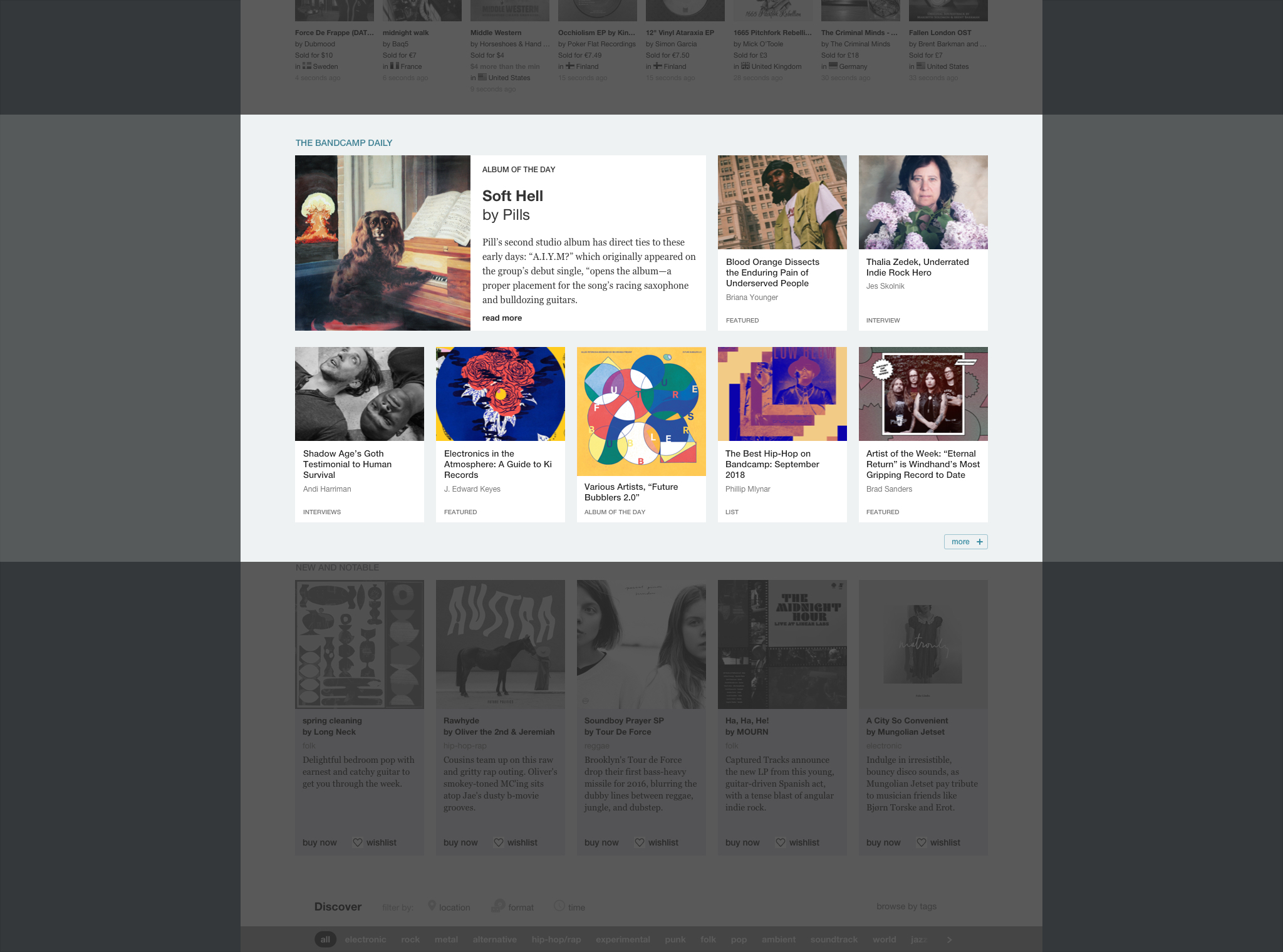
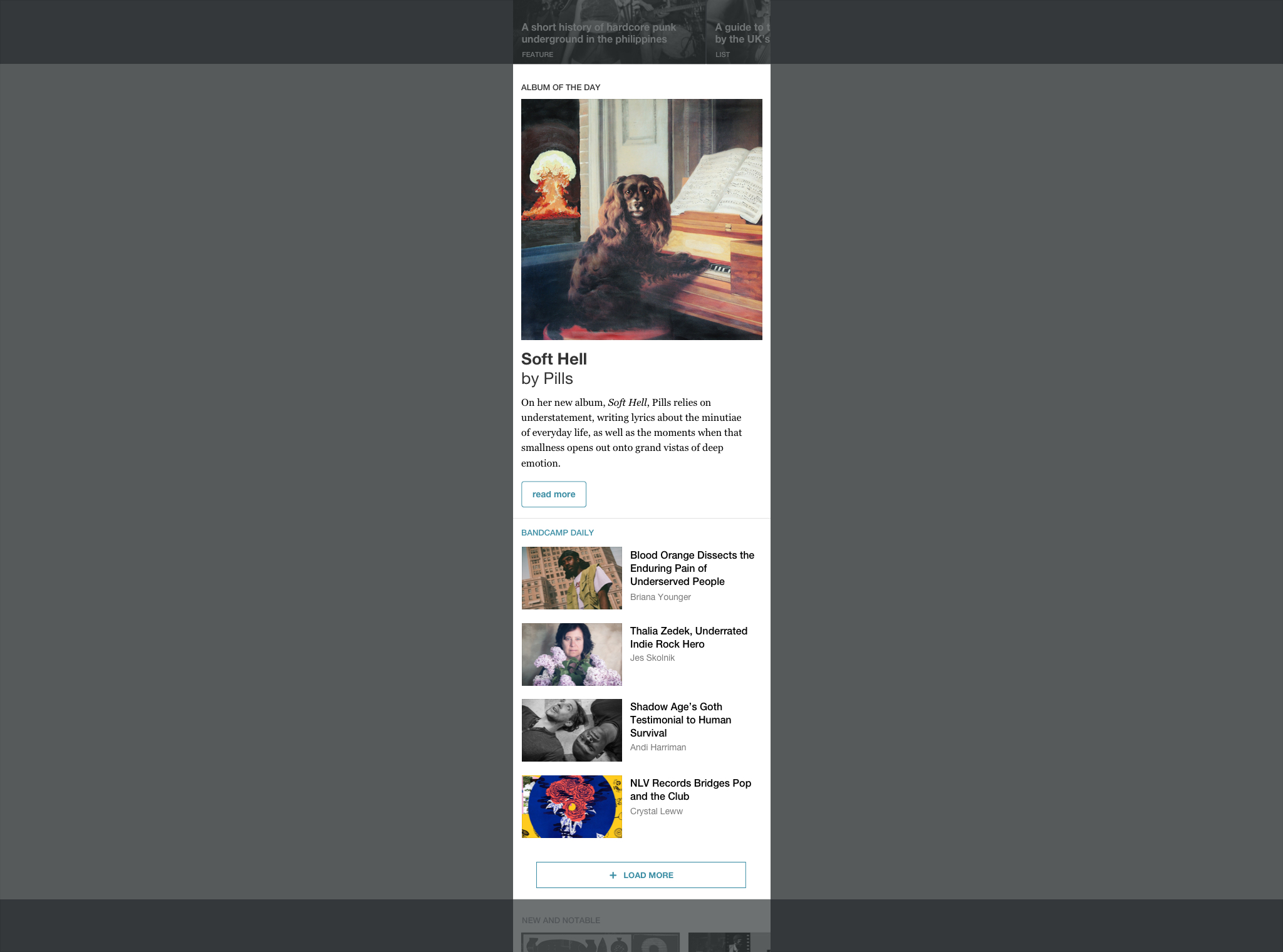
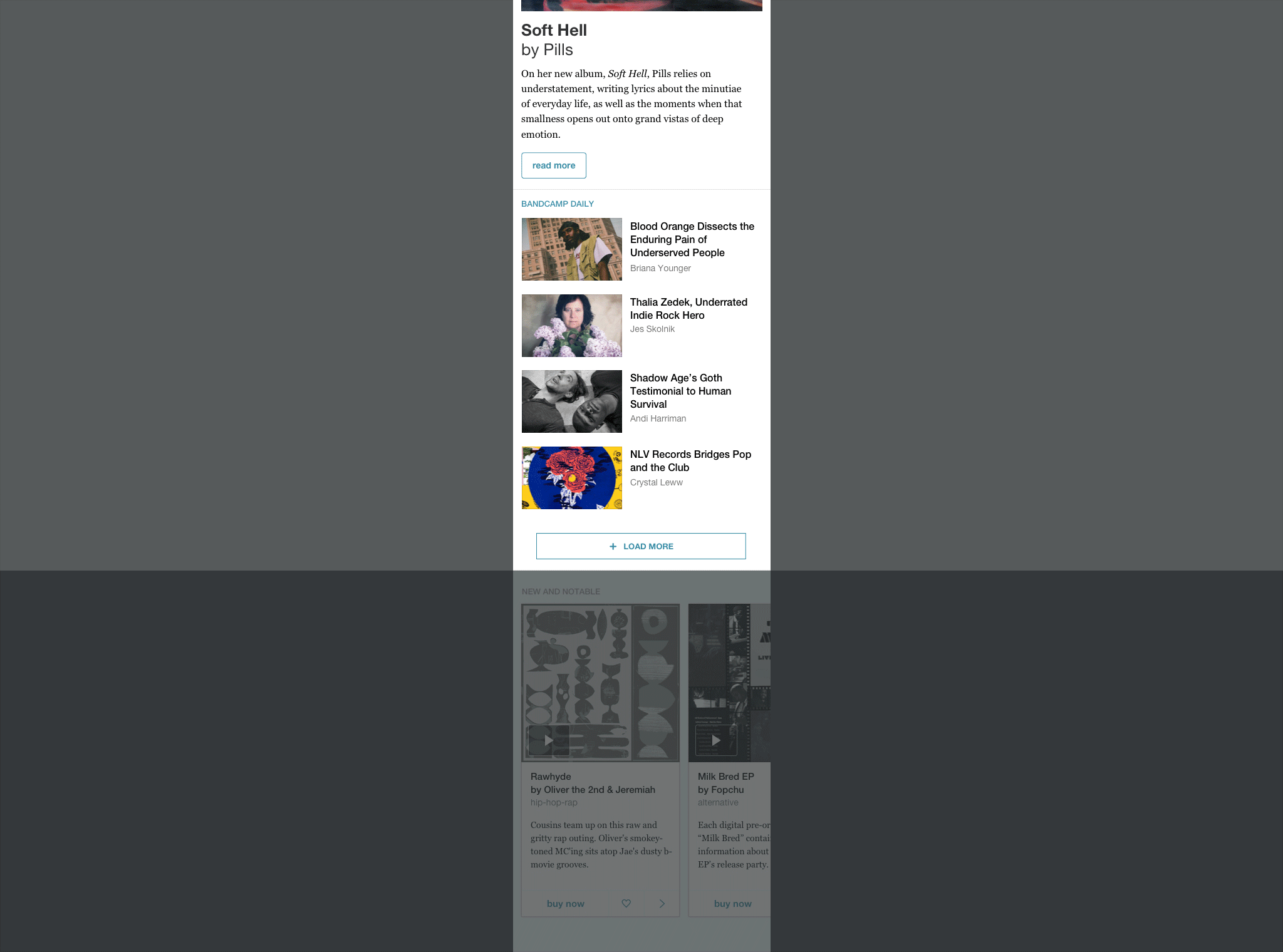
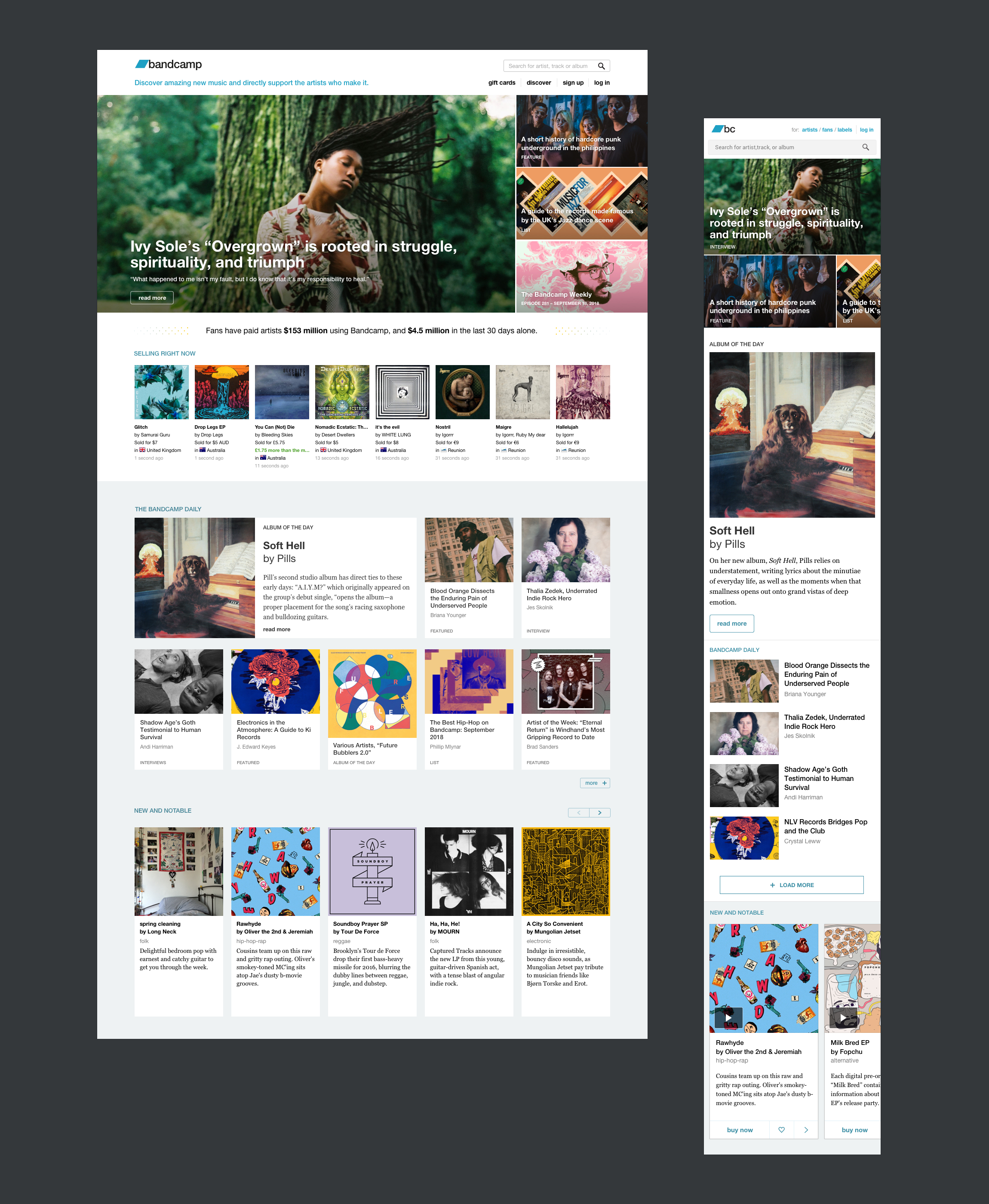
The selling now section kept its current place, while we introduced a Daily recent stories showcase below. Replacing two rows of album reviews and blog entry blurbs, this new section was intended to collect stories previously hosted in the carousel. Not all the content from the former layout was to be dismissed. Wrapped up in their own “New and Notable” section, the crispy three-sentences album review would be now owned and written by the editorial team.
Desktop layout, playing with modules! I inherited a solid grid system, with three sets of 12 / 15 / 16 columns. The idea was to work with cards, reserving the opening item for the **Album of the Day** review. Here are some modular combinations I played around with, up to the chosen arrangement.
Final design: toggling even more Daily news cards on desktop and mobile web.

Bandcamp’s New Home, the Final Design
Check out this layout live on bandcamp.com
Presenting editorial content on the homepage was a visual design problem: grids, rhythm, and whitespace balance. But solving how said content would dynamically flow into the page? That was UX design.
Behind the Scenes, the CMS
With the layout revamp came the request to work on a custom content management solution for publishing editorial stories on the homepage. Problems included:
- How content from the Daily would be uploaded/selected/featured in the carousel.
- How editors would promote/demote a specific story in the main carousel spot.
- How/where the Weekly episode would be published on the carousel
- How Weekly and Daily content in the carousel would interact.
- How carousel Daily stories would move to the archival section below.
- How the Album of the Day would be updated, and where previous instances would show.
The three types of editorial stories — Daily features, Weekly episodes, Album of the Day reviews — required different approaches. The Weekly was supposed to update automatically, as well as the Album of the Day. Editors wanted maximum flexibility for featuring and promoting content in the carousel — favouring a manual solution. Older carousel stories should then automatically be flowed into the archival cards below.
I took these requirements and came up with a set of rules that combined automated and manual behaviors, designing a simple (proprietary) CMS system.
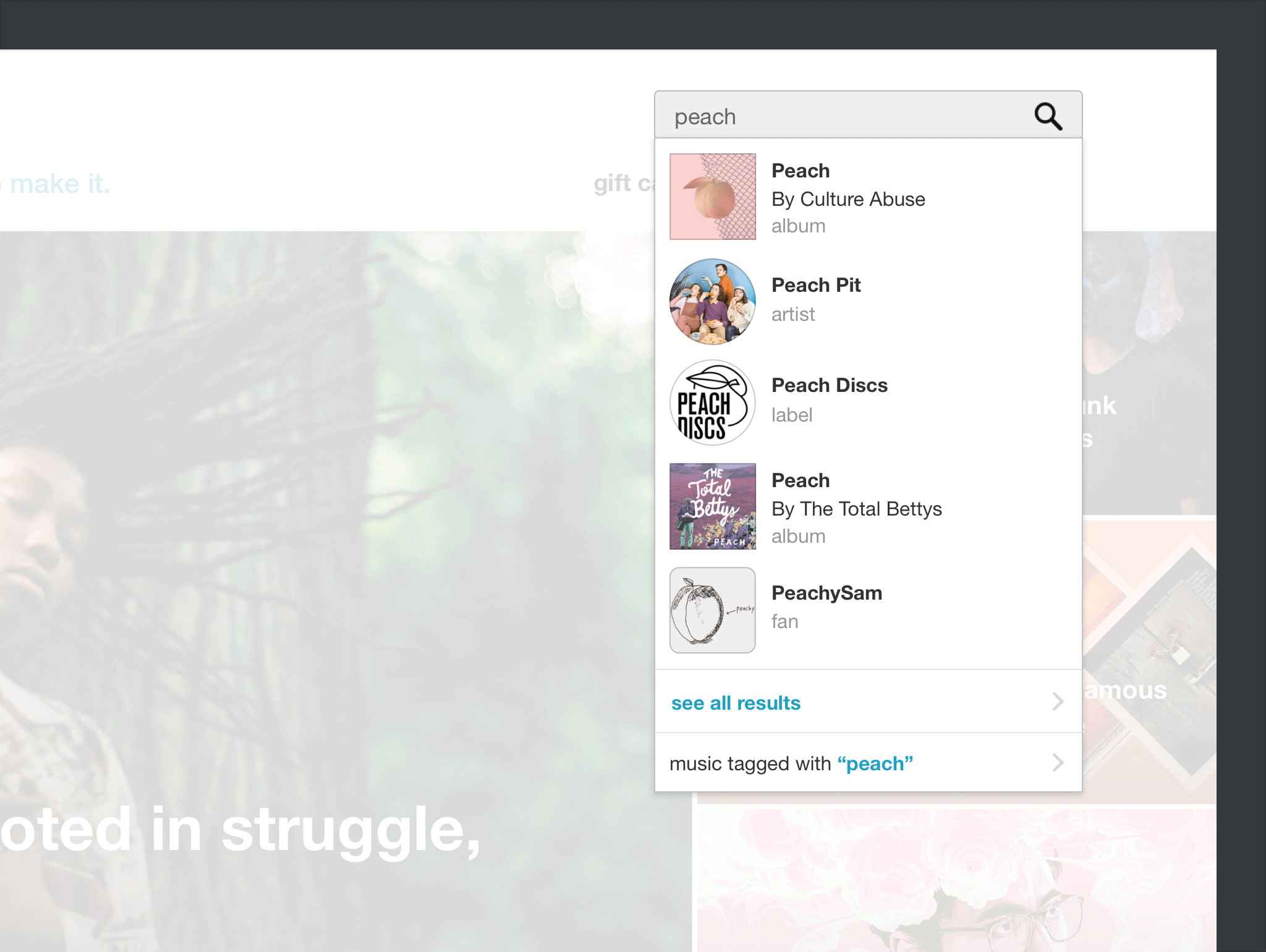
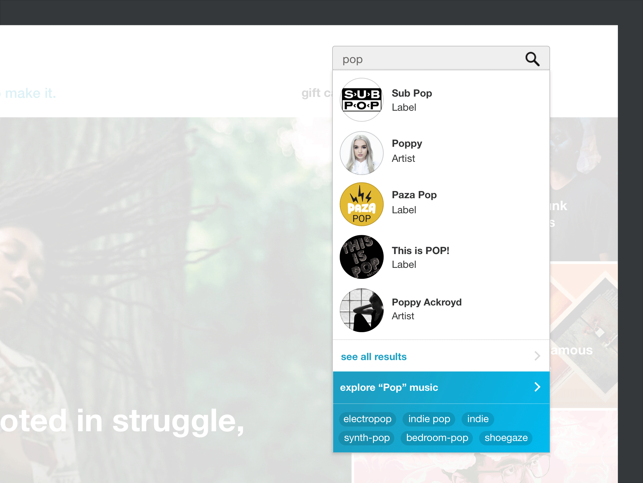
Search Autocomplete (a two day hack)
Every year Bandcamp’s distributed team comes together to spend a week catching up, in real life. Usually working from our home offices, we get the chance to discover who’s actually very tall, and break the video chat habits. In 2017 Alexandra Hindley (Labels’ engineering lead) and I took over a 48-hour mini project, implementing a first version of an autocomplete in the homepage search bar.
Searching for a generic word (1) and Searching for a keyword matching a music genre (2) . If a word matches one of our pre-defined music genres, the autocomplete returns a shortcut to the genre page, and a list of related tags/genres.