Launching Bandcamp’s digital Gift Cards
Filed under UX/UI, Art Direction, Project Management, User Testing
What was the project about?
Up until gift cards, selling has been exclusively reserved to artists. For the first time, this was changing, and Bandcamp would start selling its own product to fans. The project’s brief I received detailed the complex accounting behind the scenes, and restricted the first version to digital cards only.
Revenues, payouts, and fraud prevention posed a challenge, but the idea was “well-known and simple”: folks would come to the site to buy a gift card for a friend or partner, the giftee would redeem the said card and spend their credit in music and merchandise. Launch was to be a few days before Christmas.
What was I asked to do?
- Art direct illustrations for the cards, choosing artists and coordinating their work
- Submit a strategy for implementation, in order to meet the Christmas deadline
- Design UX/UI of gift card purchase, card redemption, and purchasing with gift card credit
Art Direction
We wanted to commission original artworks for the cards, and having them work on the subject of music listening / music genres. Looking at my Instagram illustration saves, I gathered some names and reached out to start a collaboration.
The brief was to create a design that would feel like a pattern, but in an organic way, without using a strict grid. Each of them had to come up with two illustrations, one with darker tones, and one with ligther ones. I suggested a couple of different musical moods and genres to each, trying to align with what I felt was their style.
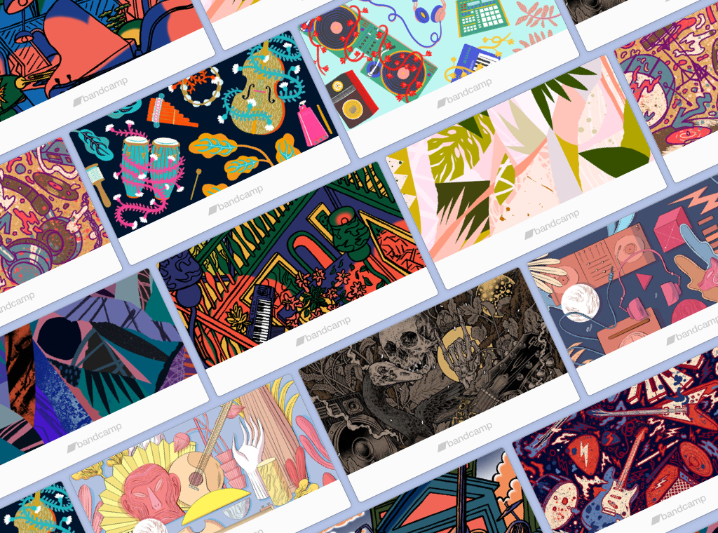
We ended up with 12 illustrations (guess which one is the metal one!):
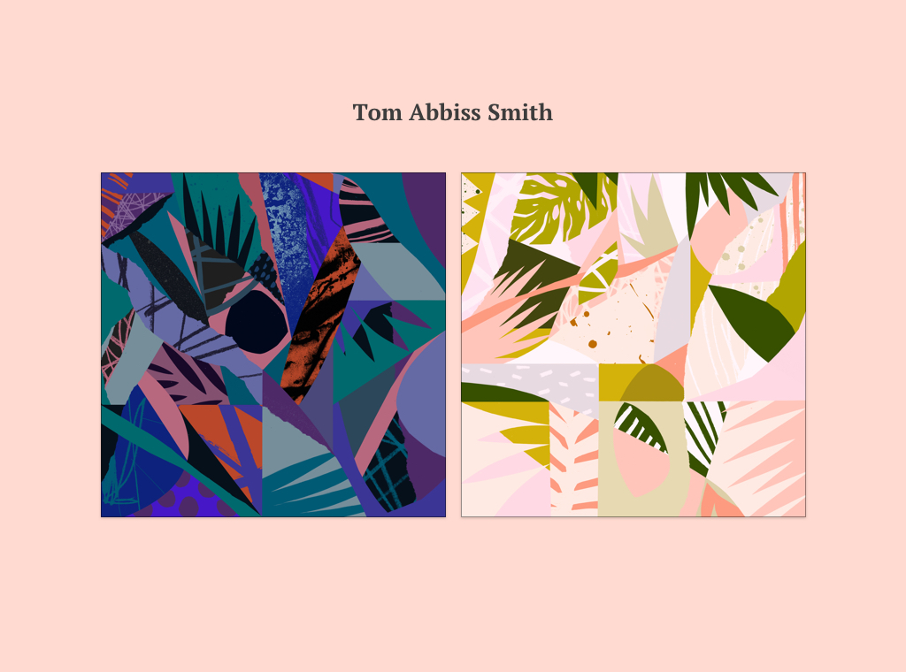
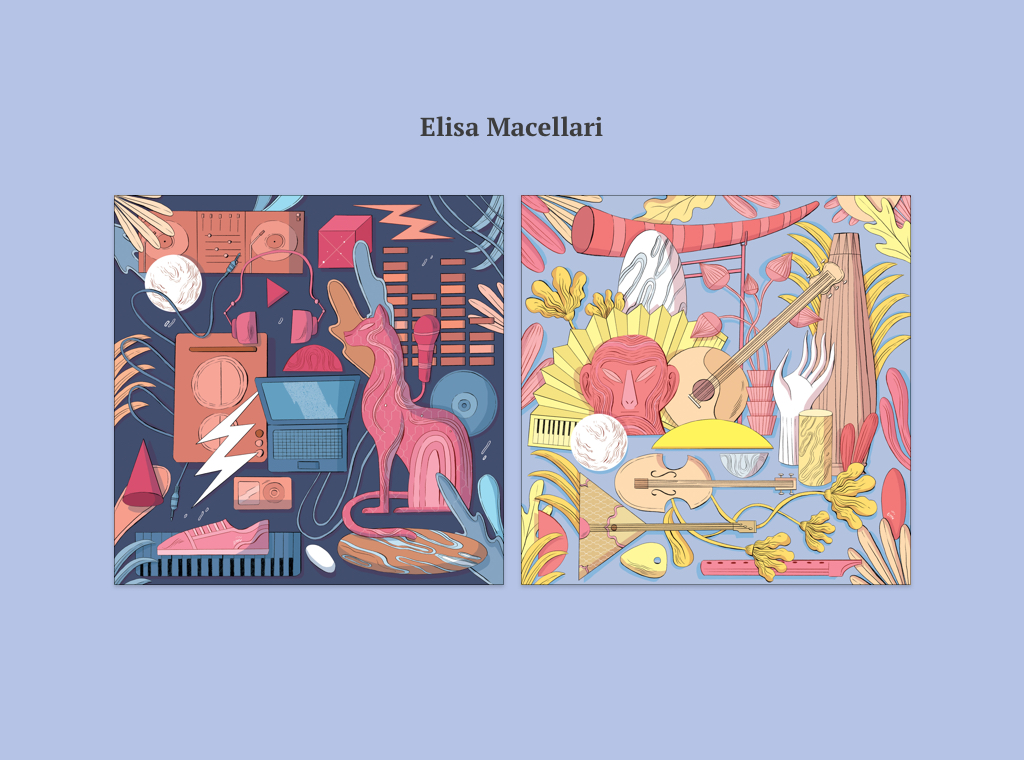
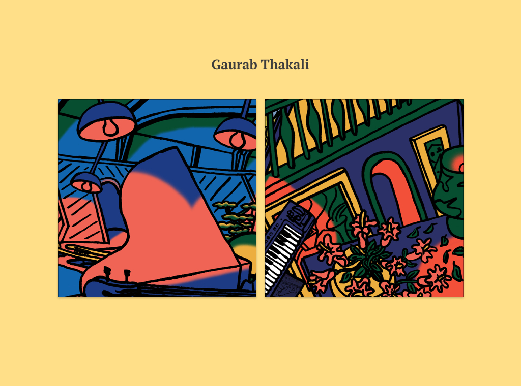
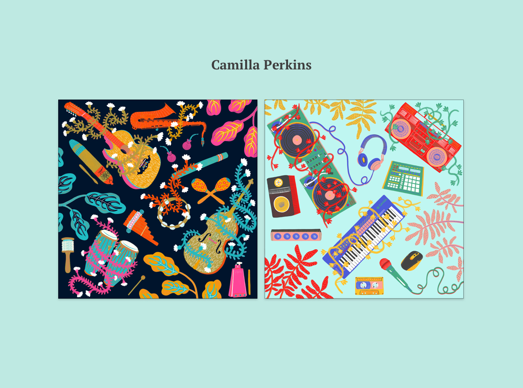
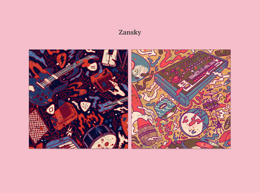

Final patterns from the following artists: Tom Abbiss Smith (UK), Elisa Macellari (Italy), Gaurab Thakali (UK), Camilla Perkins (UK), Zansky (Brasil), R . A . Y . A. (Indonesia)
Project Management
How we Used to Work
In Bandcamp’s world, one designer would take charge of a whole feature, beginning to end. My usual process would look like this:
- First I would iterate through draft proposals, continually refining them with the feedback of my design lead.
- Once we’d agreed on a solution, we would ask upper management’s approval.
- If there were any, we would work on management requests for changes.
- After management’s approval I would start writing the technical specs.
- I would hand the specs over to engineers, and walk them through the plan.
Why Change the Process?
The project had a hard deadline: we wanted Gift Cards out for Christmas. I wrote down some questions to myself, to understand the problem’s ramifications.
How many parts of Bandcamp are affected by this feature? What are the implications on the artist side? And on the fan side? The feature was wide reaching, touching the purchase flow, the sign up flow, email notifications, and artist payouts.
We soon realized that with the usual workflow, engineers would have been idle for some time, waiting for me to deliver a colossal spec. Then they would have needed the time to digest the doc. With that in mind, launching in time looked like a mirage. I wanted the team to get started immediately with modelling the underlying infrastructure, without needing to know the fine details of final UI.
The New Strategy
My proposal was:
1. Splitting the process into (3) blocks
- Gift card purchase
- Card redemption
- Gift card balance purchase
- Before doing any visual design work, write down the structural decisions for each block.
- These preliminary specs would answer questions such as: In which ways buyers will share the gift card? or What would happen when a fan gets gift cards in different currencies?
- Passed the doc to the engineers, let them get started with infrastructure, and get their feedback.
2. Designing & implementing block by block
- Treat each block as an independent sub-project, working on design solutions, getting approval and then submitting the partial specs for review and implementation.
- Engineers could attack the first block without waiting for the whole project’s design to be final.
- Since we defined the general structure in the previous step, we had a good overview of the connections between the three main blocks of the feature.
3. Creating a separate funnel for the gift card purchase
- Engineers would look into streamlining the gift card purchase flow.
- Separation ensured the gift card purchase would be completed in two steps maximum.
- The goals were limiting drop offs and keeping the focus on the user’s original intention.
We all agreed this plan was giving us the confidence to deliver the project in time.
Engineers had to evaluate how to separate the gift card purchase from the main purchase flow, but it was a crucial point for simplifying and smoothing out the flows. With that, gift card buyers would have not needed to care about other items pending in the cart.
User Experience & UI
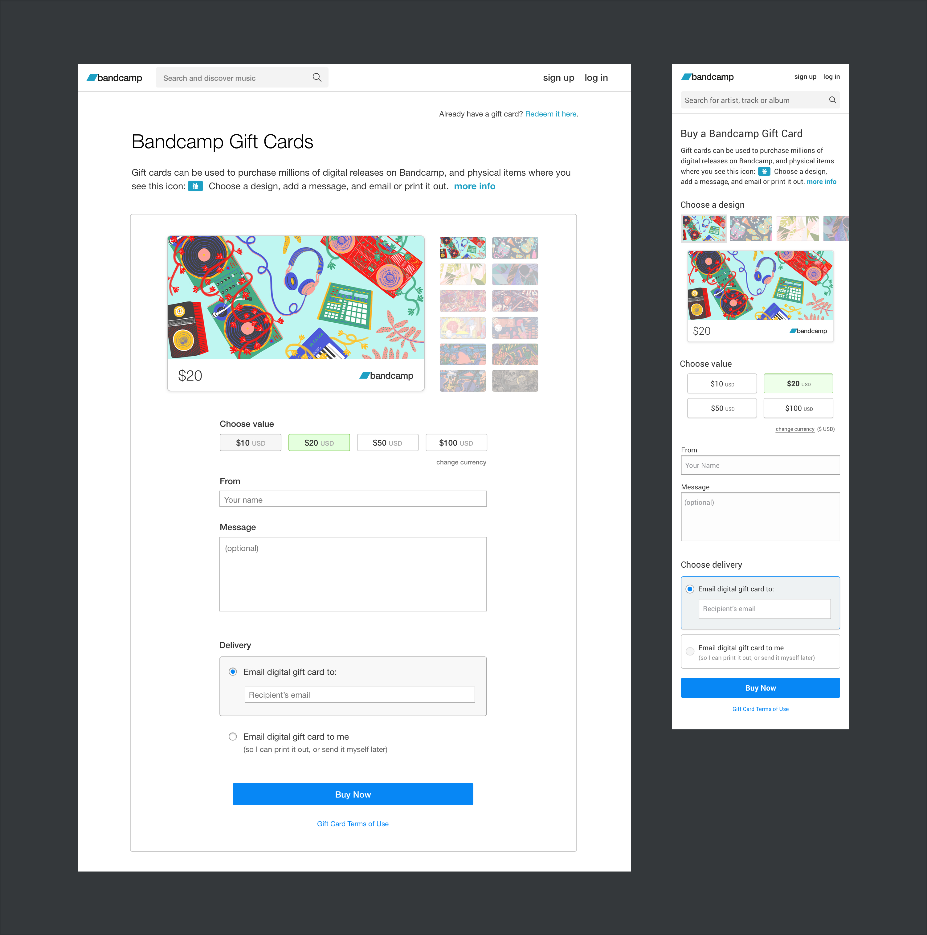
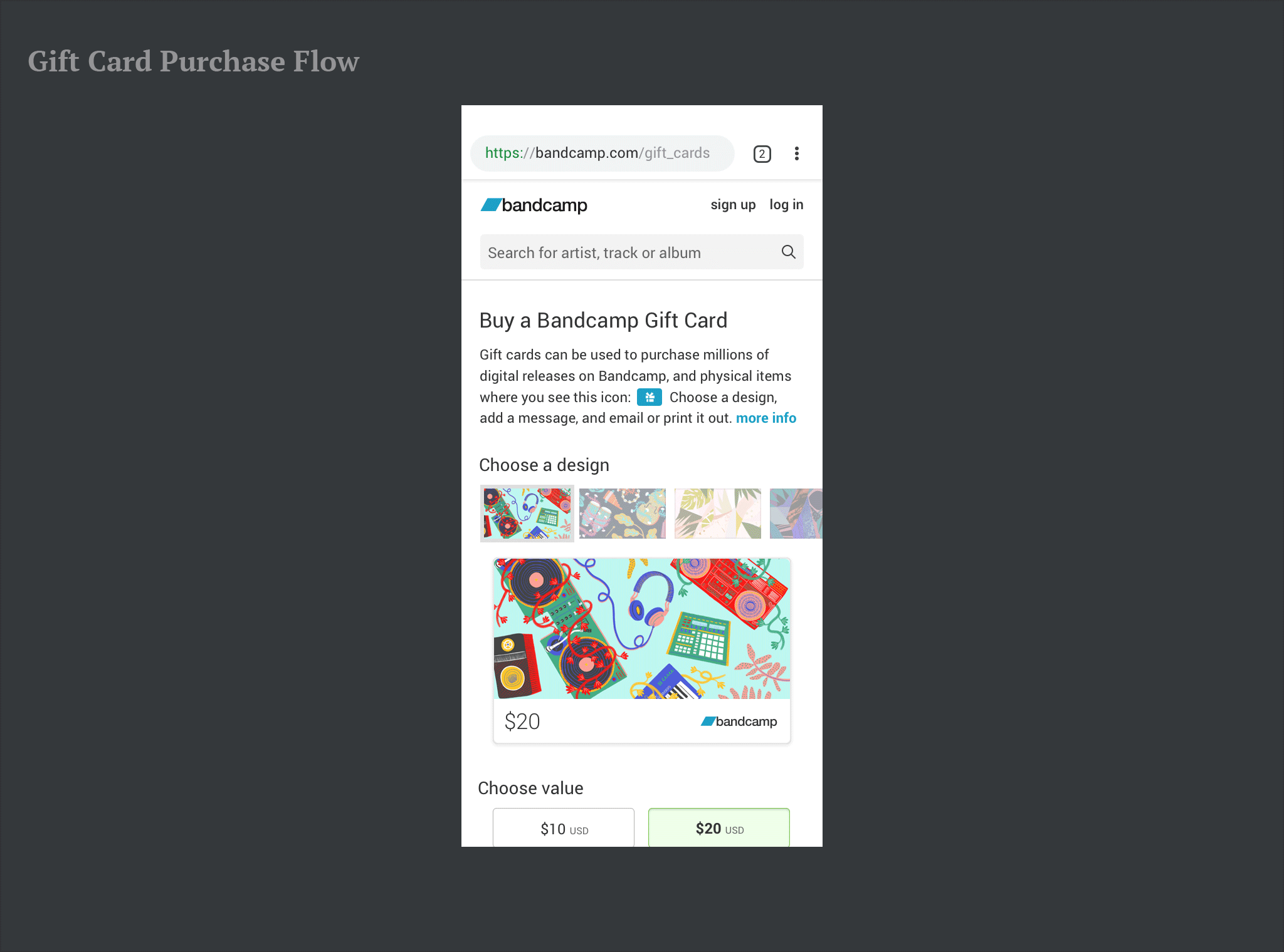
The Purchase Page
The first step was designing a Bandcamp Gift Cards purchase page. Placed in the Bandcamp’s branded pages section of the site, the page would be linked from the header (during the holidays) and in the footer (year round.)
Final design for the Bandcamp Gift Cards purchase page. A note about GC in the apps: the original plan didn’t include the GC purchase through our apps. Redemption and spending the gift credit were weighted, but the tight deadline cut on that implementation too.
Buying a Bandcamp Gift Card
The goal for this part of the project was to streamline the flow. Users coming to buy a gift card would be highly motivated, and would want to complete the purchase immediately, without distractions.
To support that, I decided for:
- No “add to cart” functionality, only one “Buy Now” button.
- Allowing guest checkouts like elsewhere on Bandcamp, and avoiding sign up form drop offs.
These preliminary decisions greatly simplified the GC purchase flow.
The only attribute we carried over to this new, separate GC checkout was the payment method preference. In 2016, with the introduction of credit card purchases, we silently saved users (last) payment method choice. On their next purchase, users (registered and unregistered alike), would be either wired to PayPal or the credit card form based on that preference.
Considering this, I identified 4 distinct gift card purchase flows:
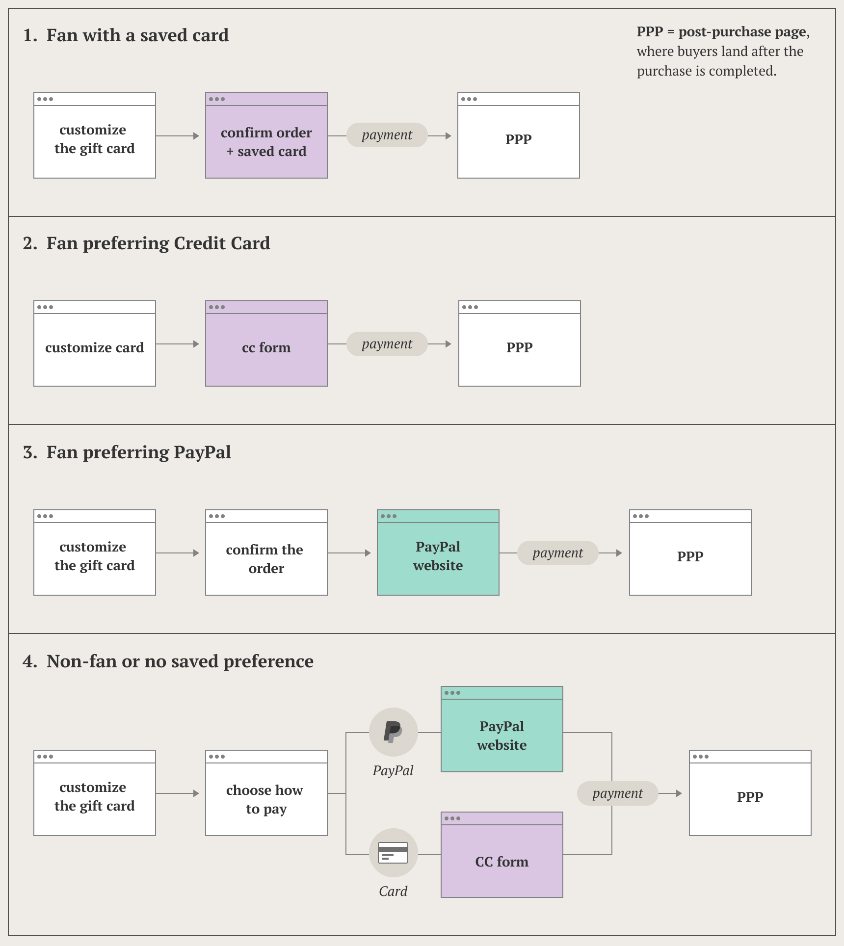
UI changes for stored preferred payment method. Users would be asked to choose the payment method only once. On the next purchase, the buy buttons reflects the choice. The same pattern is used on the regular purchase flow.
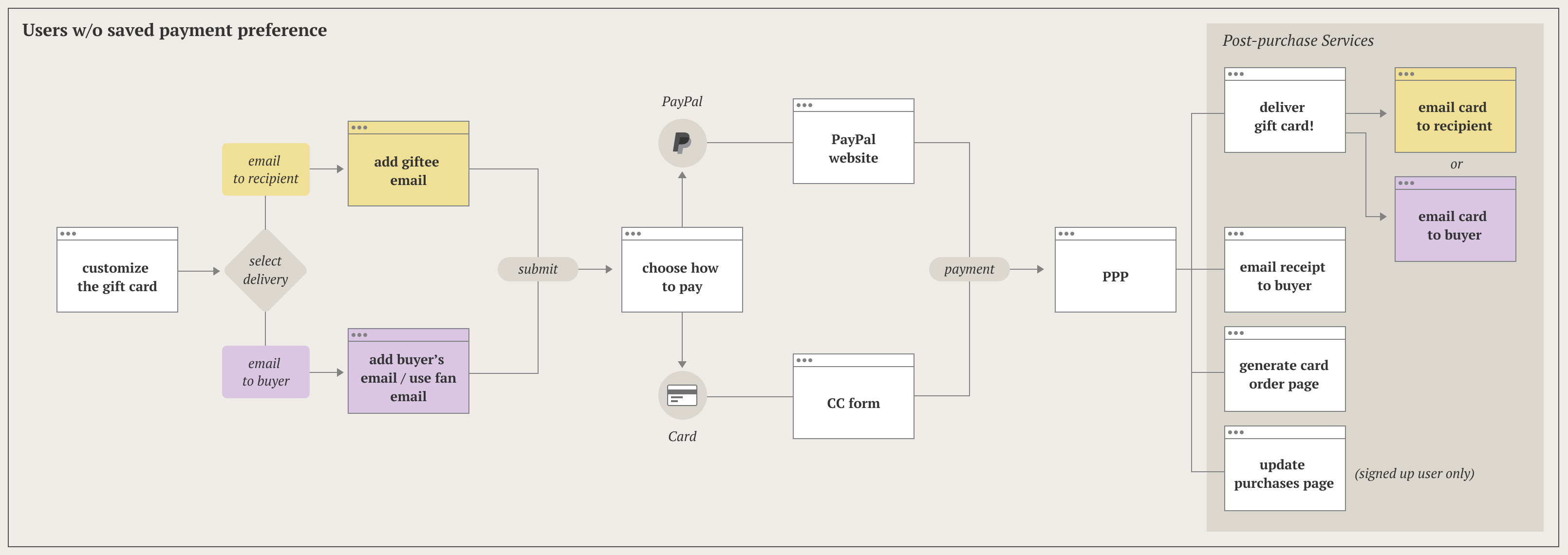
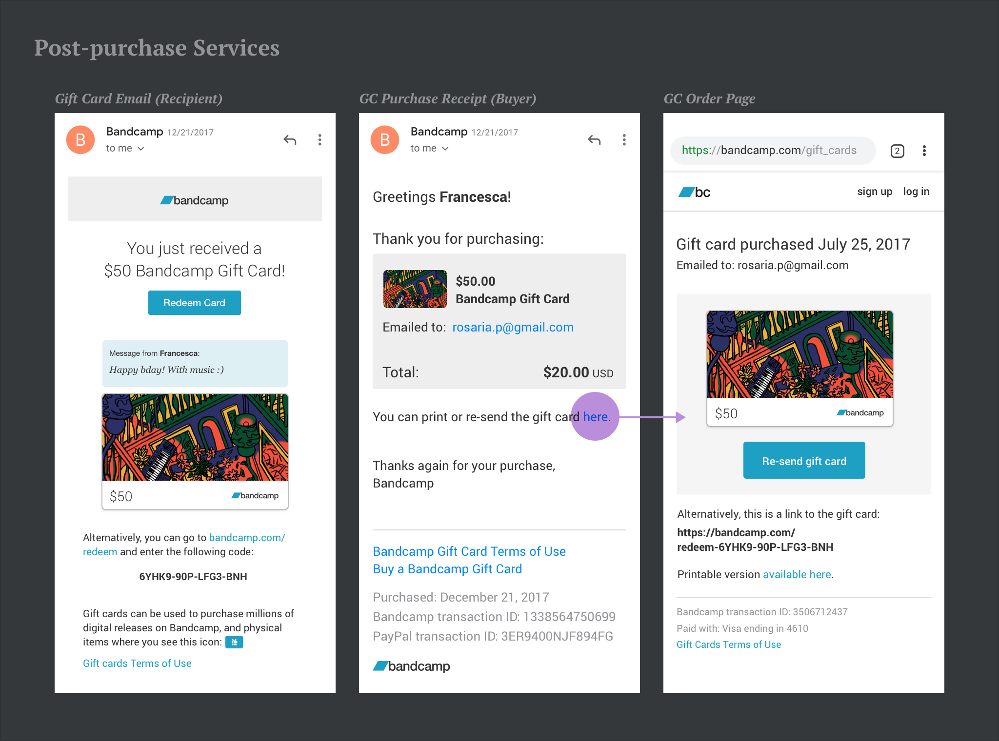
From a user’s perspective the purchase finished with landing on the post-purchase page. To design and implement we had to go deeper than that, taking into account the post-purchase services. Post-purchase services are all the automated actions triggered by the purchase. For GC, they included: sending the buyer a receipt email, generating a gift card order page and link it in the said receipt; send out the delivery email, to the recipient or the buyer.
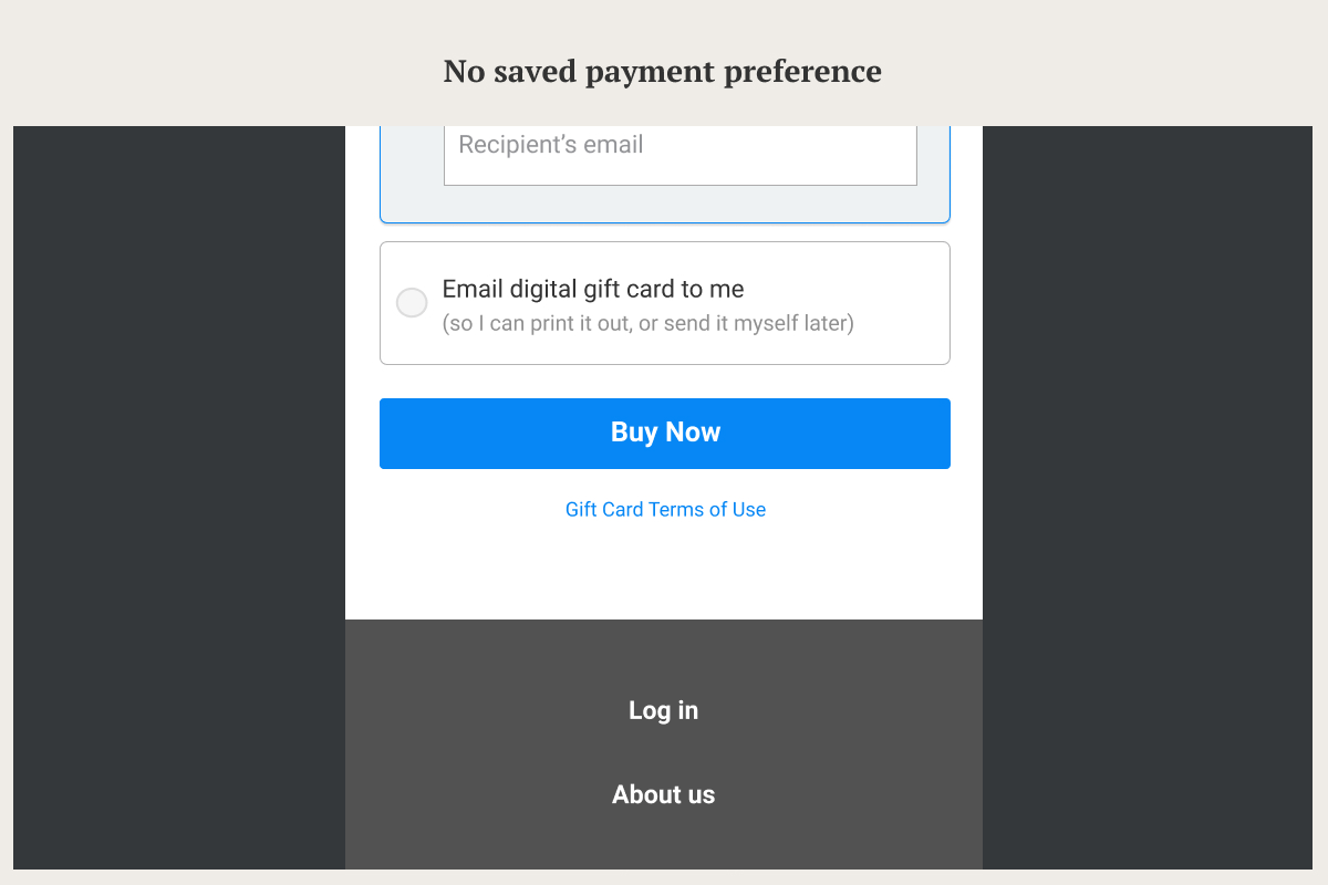
About delivery options, buyers could choose between:
- Emailing it to the recipient immediately
- Emailing it to themselves, receiving:
- a printable PDF (to deliver the gift in person)
- a share link (to send the gift with a message)
To be sure all the pieces were falling into the right place, I produced a second round of more detailed user flows. At this stage, the purchase flow for a user with no saved payment preference surely looked busier:
Check out Bandcamp Gift Cards live at https://bandcamp.com/gift_cards to see how buying feels.
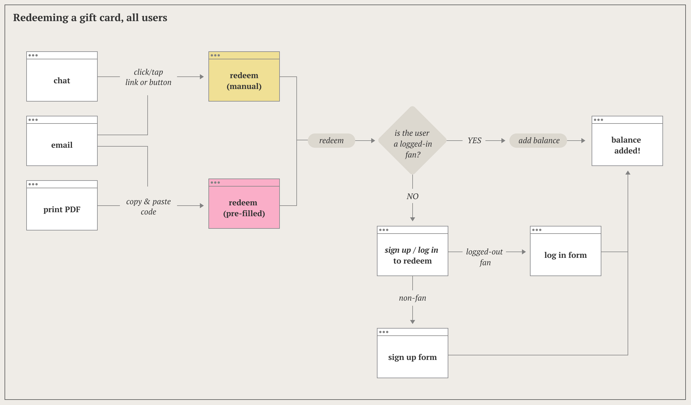
Redeeming & Using a Gift Card
Now let’s explore the giftee’s experience. There were 3 user scenarios for redeeming a card:
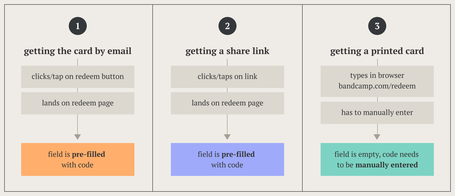
Pre-filling the code field helped making code redemption as user friendly as possible. This included:
- Ensure that copy and paste would always work, no matter if it included extra spaces or the dashes.
- For manual enter, converting lower case to upper case when typing, and automatically add the dashes.
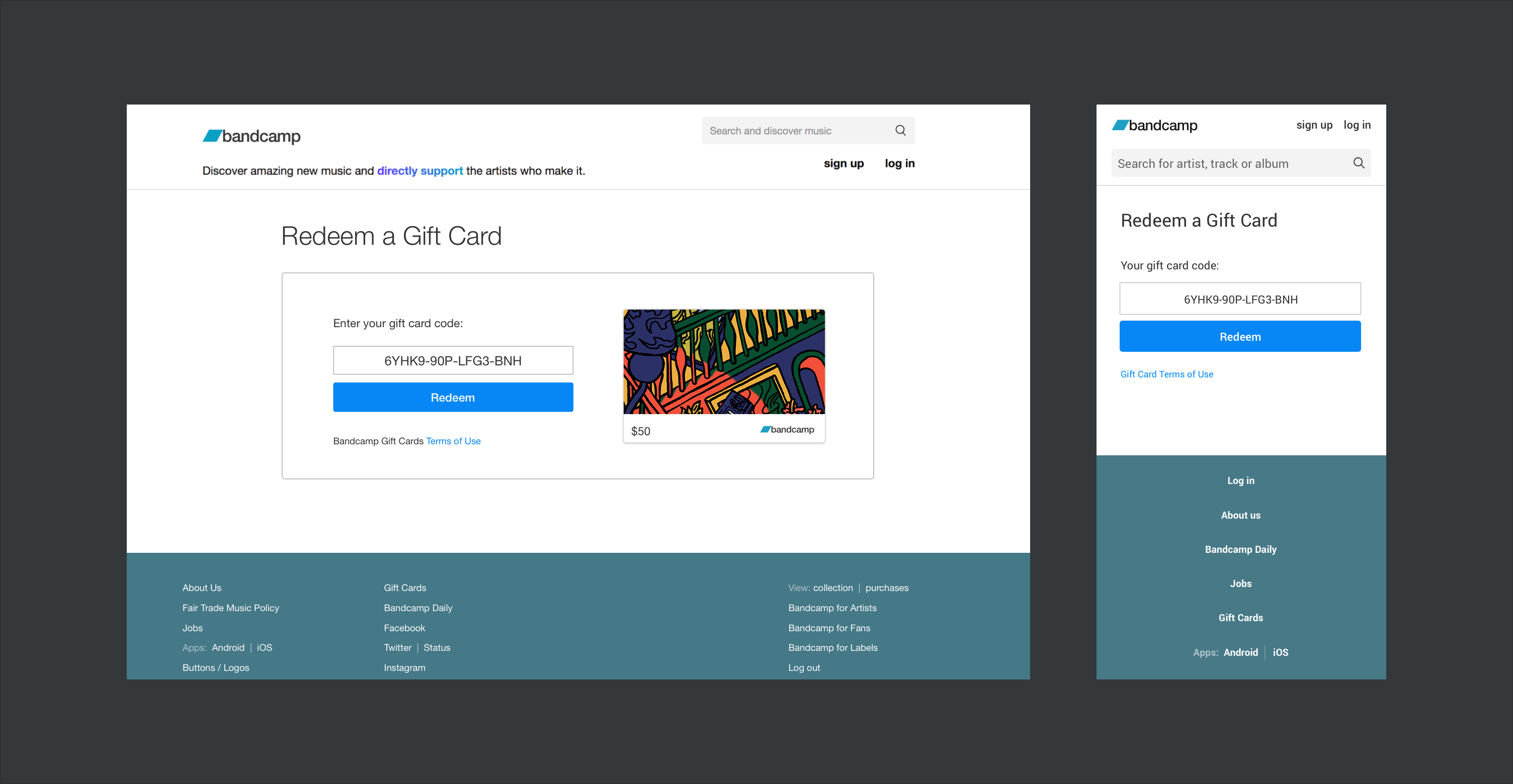
Code redemption required that all users must sign up for an account in order to access their credit. The redemption flow would redirect users to log in or sign up in order to access the gift credit.
The original sign up flow included a guided set up of the account, the familiar tooltip tour introducing new users to their account. We added an exception for GC sign ups, so users would skip the walkabout, and just get to the confirmation that they could now use their credit.