Building a scalable post purchase experience
Filed under UX/UI (Desktop, Mobile, App), User Testing
What were we doing, and why?
At the end of 2015 I was busy introducing credit card payments. Up until then the only payment system available was PayPal. Restructuring the purchase flow, I took a stab at improving the page where buyers would land after they complete their purchase.
The post purchase page—PPP, informally—was not designed around a grid, and wasn’t visually consistent across platforms. I discussed the opportunity to make the PPP redesign its own project with the design manager. He supported the decision telling me “this is Bandcamp’s most important page.” “No pressure!” could have been a timely response, but I do love a design challenge.
What was I asked to do?
- Redesign the post purchase experience for mobile web, desktop, and the fan app.
- Create layout and logic that would make the post purchase page scalable in two ways:
- In itself, going from single item purchases to large shopping carts with a complex mix of items.
- For when new types of items would be available for purchase (ex: gift cards.)
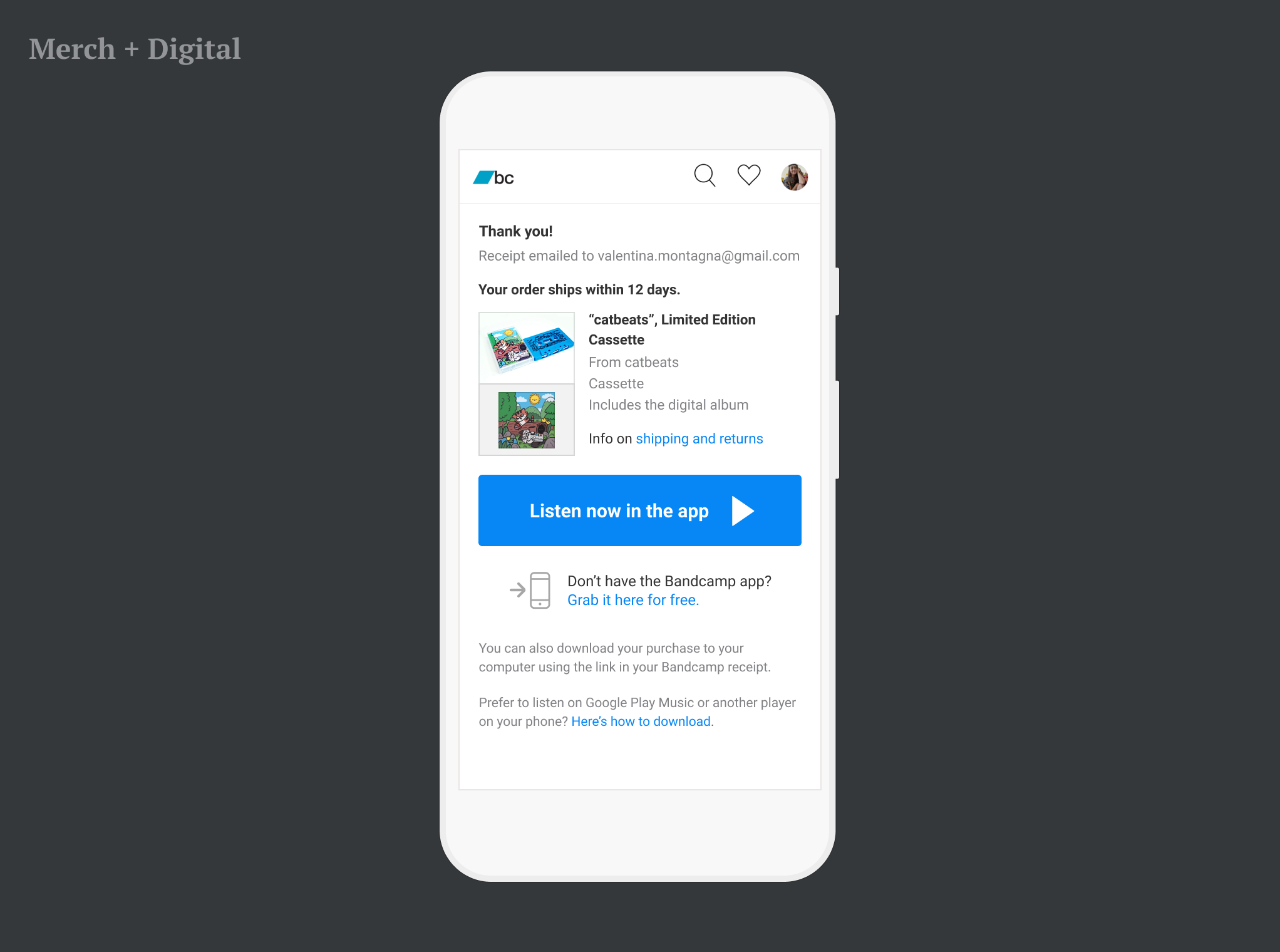
- Focus the communication on streaming, nudging users to install our listening app.
Preliminary Work
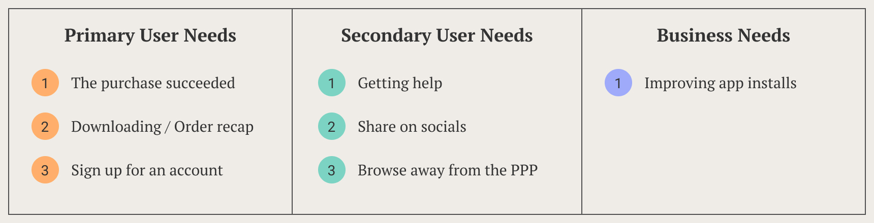
Before design, there’s research. First steps were:
- Establishing user needs, to define the scope of the redesign.
- Defining what a successful design would do, for business needs.
- Analyzing the current PPPs, and their shortcomings.
After clarifying what the page should do, I took screenshots of the current PPPs, and built an inventory of all the cases. I took notes on why the PPP wasn’t supporting user needs correctly—structurally and visually.
Designing for Scalability
The number of PPP cases and their characteristics depends also on the nature of the items sold. Before diving into UX details, I wanted to answer the question: what are all the items artists can sell on Bandcamp?
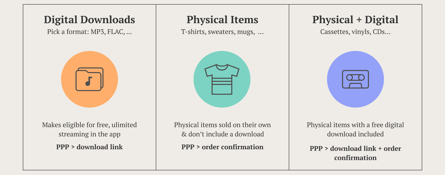
With this in mind, and the cases inventory at hands, I started working on the information architecture.
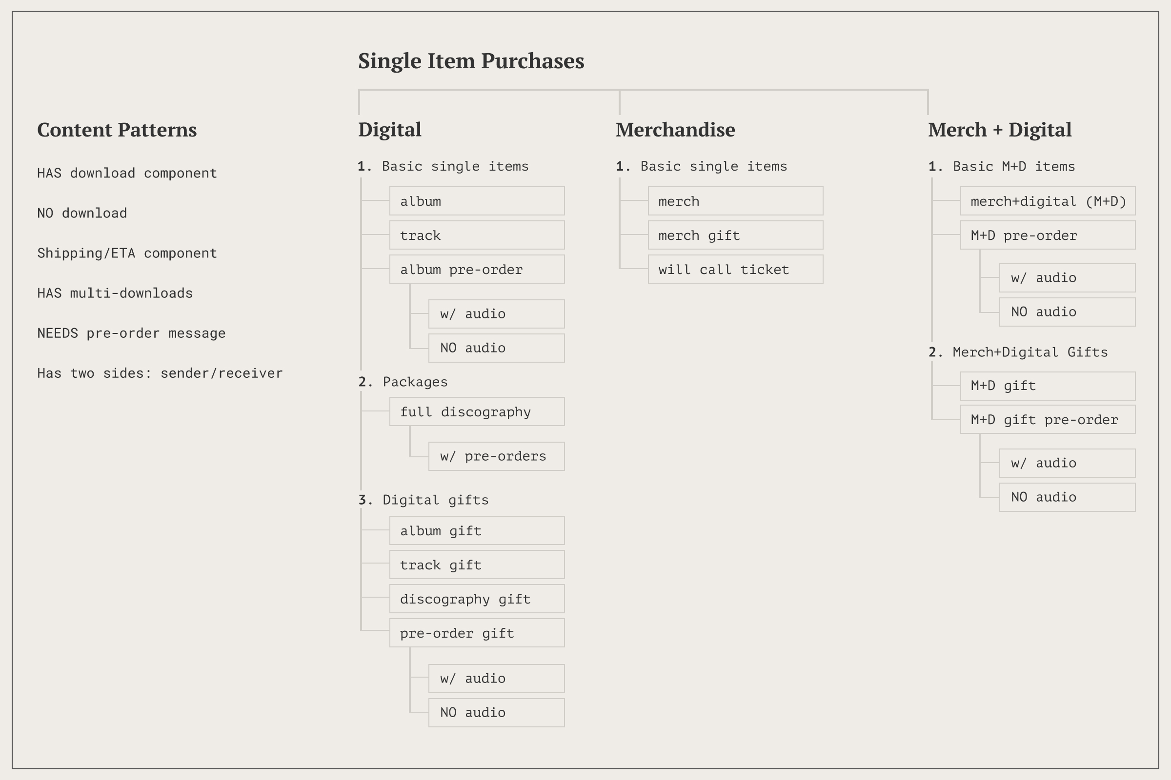
Only a very small percentage of purchases belonged to carts, I started with single item purchases, and made them the baseline. The idea was to discover recurring patterns among cases, and turn them into logical/visual modules in the new design.
Information architecture, single purchase cases tree. Left column: the common patterns I identified; right: ramifications of the cases. The animation highlights the patterns’ distribution among the cases.
The Solution: Function & Layout
The Context
The purchase experience was shaped by a number of attributes:
- Purchase mode: single vs cart
- User status: logged in fan / logged out fan (recognized by email) / non-fan (user without an account)
- Item category: digital vs merch
- Item type: standalone digital / package digital / gift / … (as seen in the above diagram)
- Platform/Device: web & mobile web, iOS vs Android apps
Also important to consider:
- Bandcamp allowed guest checkouts, but we still wanted to encourage account sign up on the PPP.
- Users were mostly buying from a personal computer.
- Permutations on the PPP added up to about 150, but carts were a minority case.
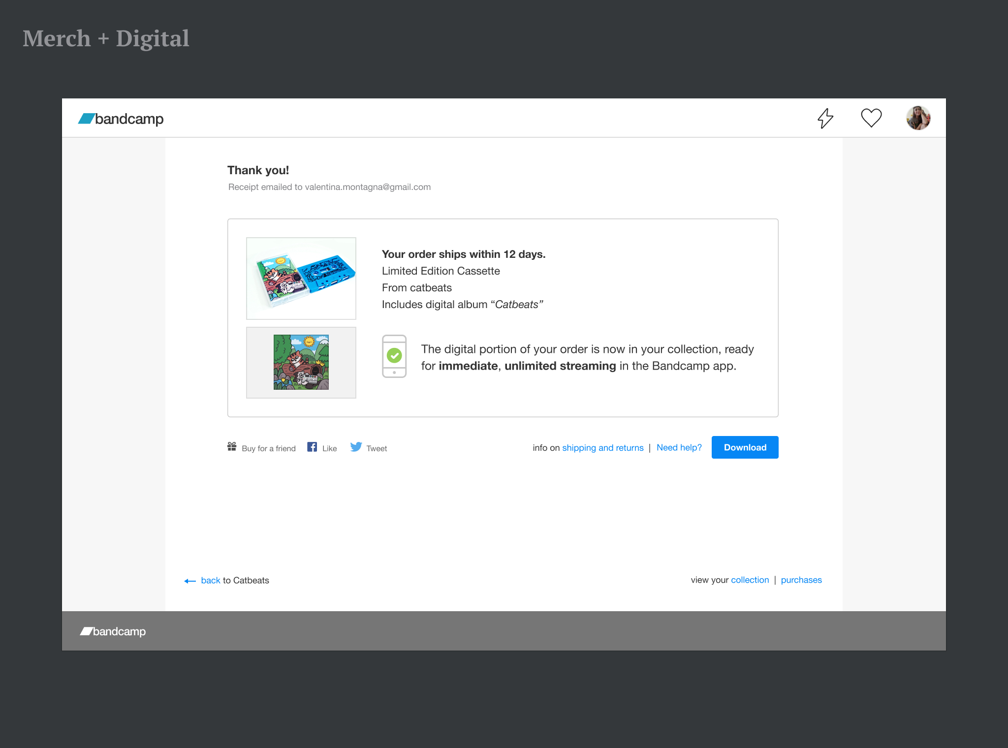
Seeing the last point, I started to design the single purchase layout, and work later on carts as its extension. I set off re-arranging elements on the page to a clearer hierarchy, and changing proportions accordingly. I made the streaming promo and purchase thumbnail the focus of the new layout.
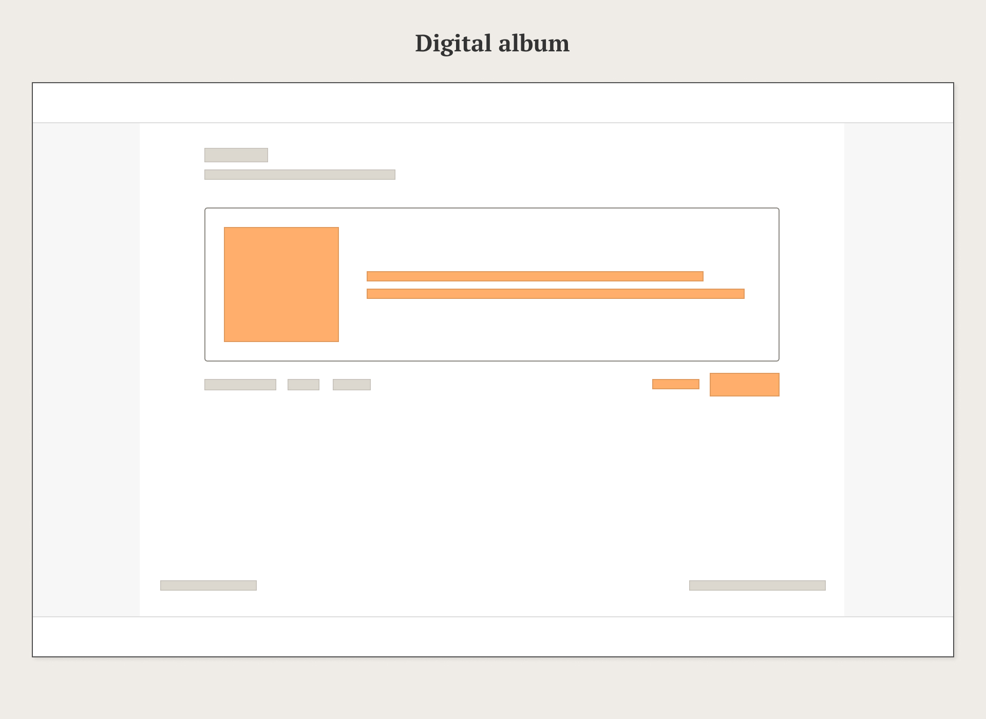
Single Purchase Layout
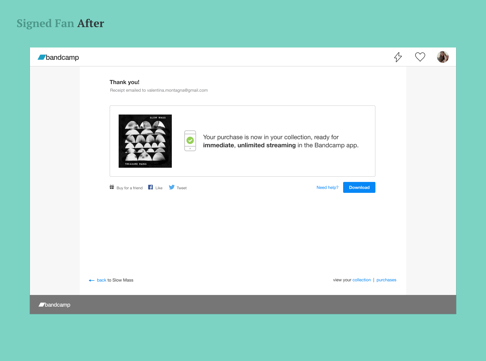
The final design was organized differently on different platforms, but all layouts followed the idea of a hierarchical page, and shared the same visual language. Later, by management’s request, the desktop re-design would change focus and promote streaming in the app, while downplaying file downloads.
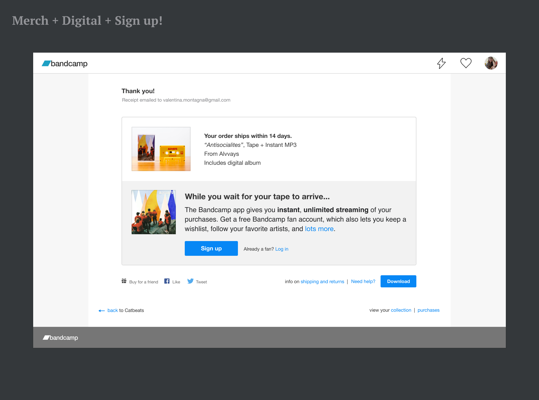
Design for the single purchase of a logged-in fan would become the foundation of all the following cases.
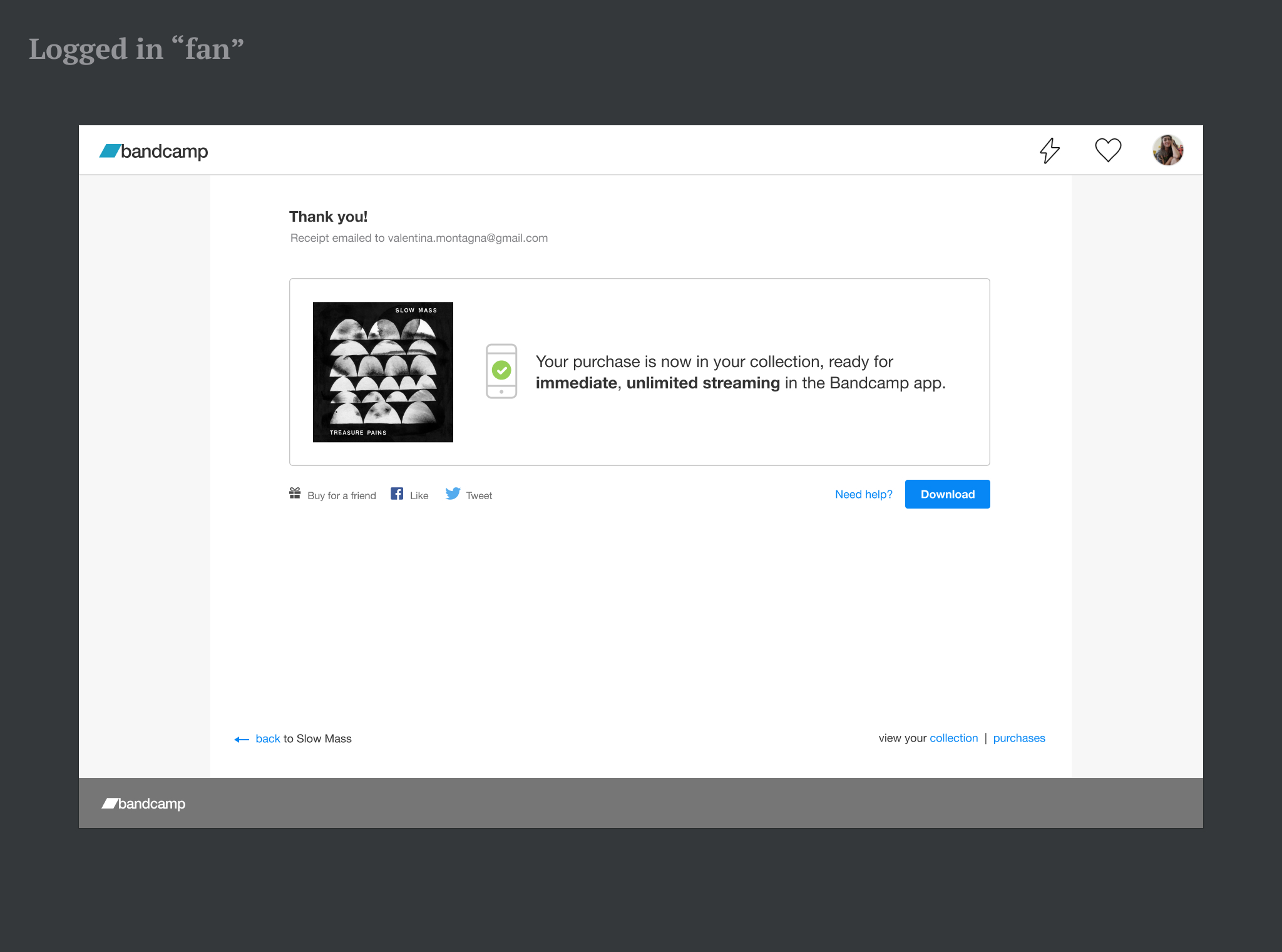
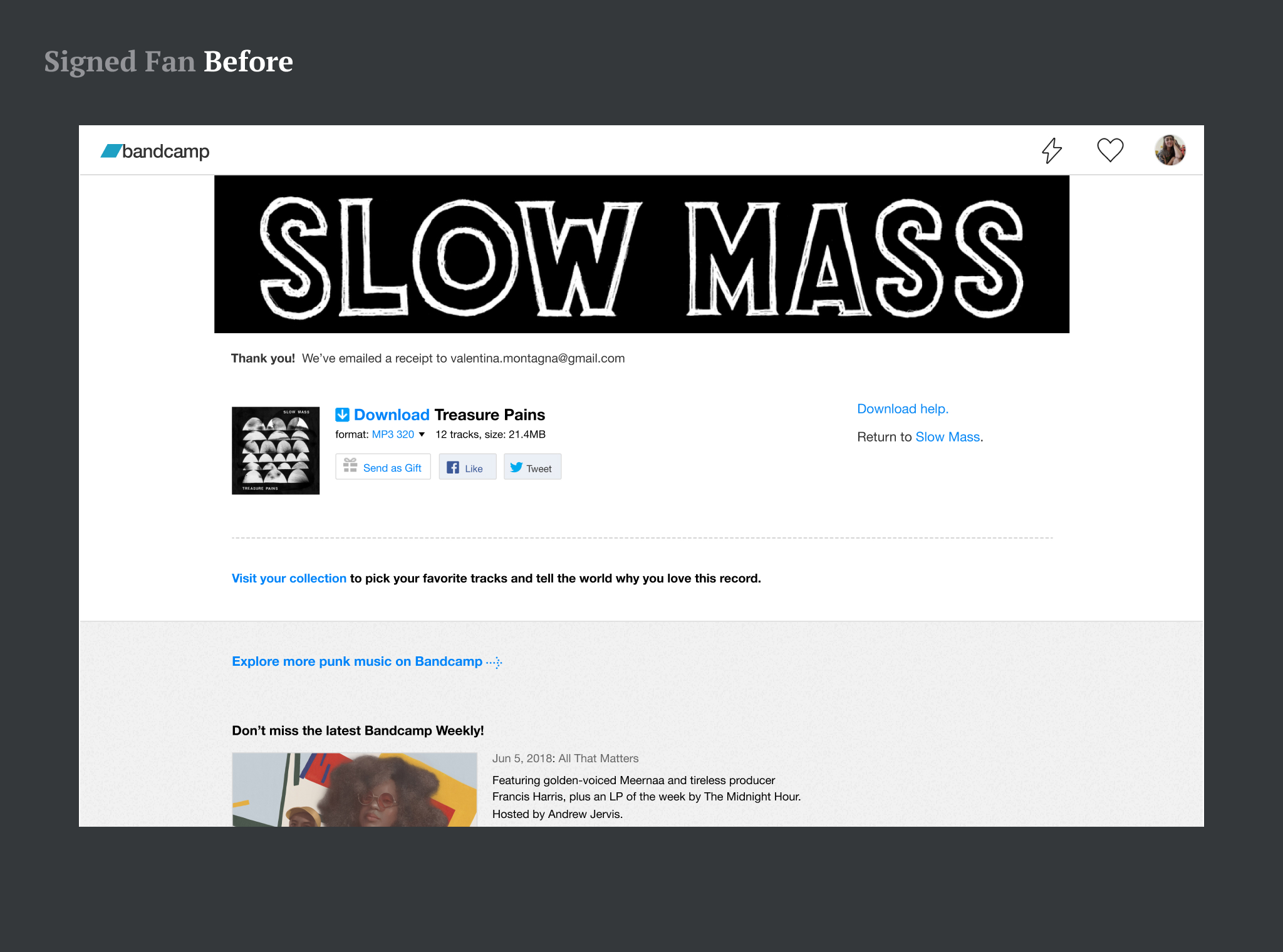
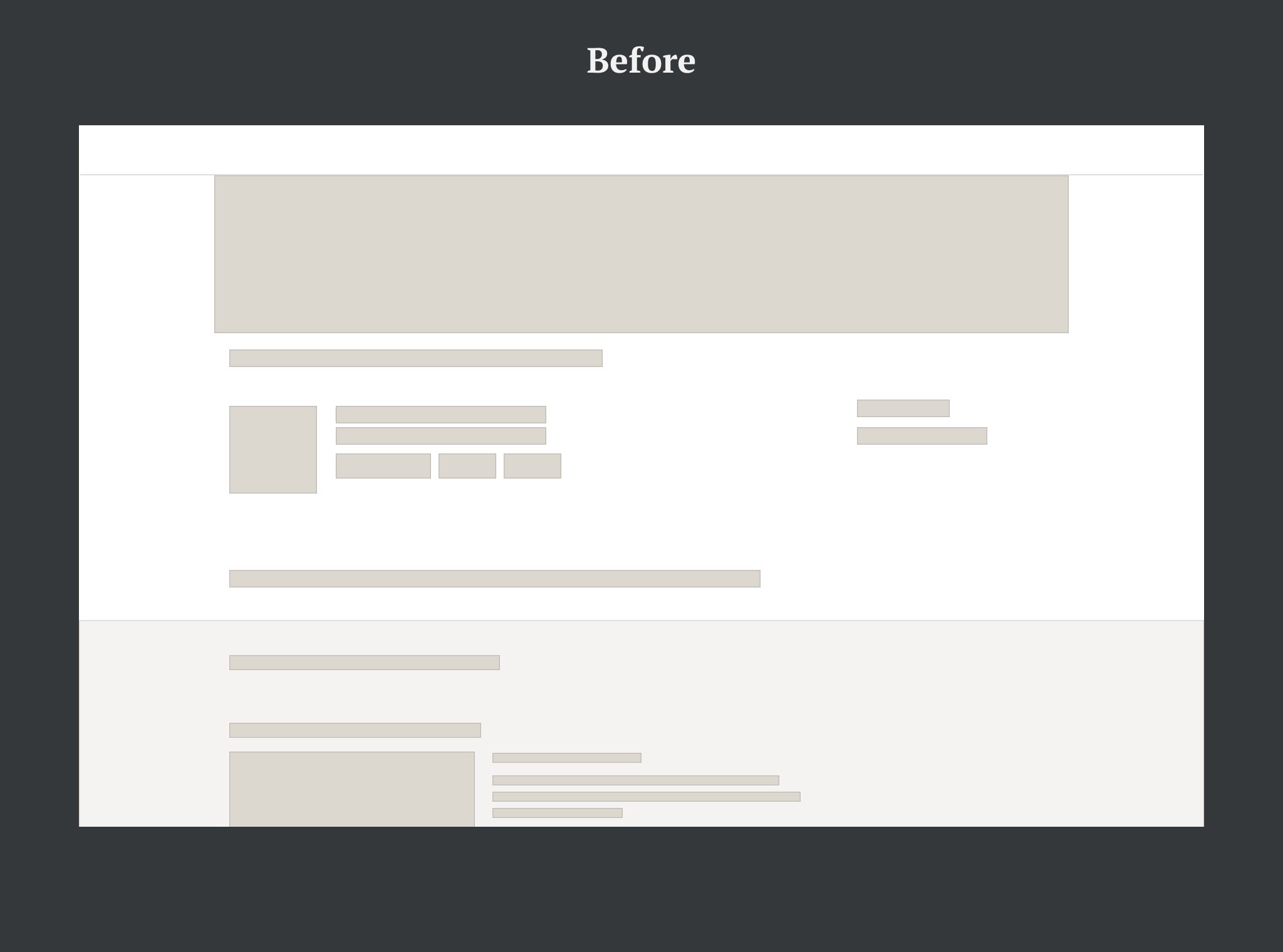
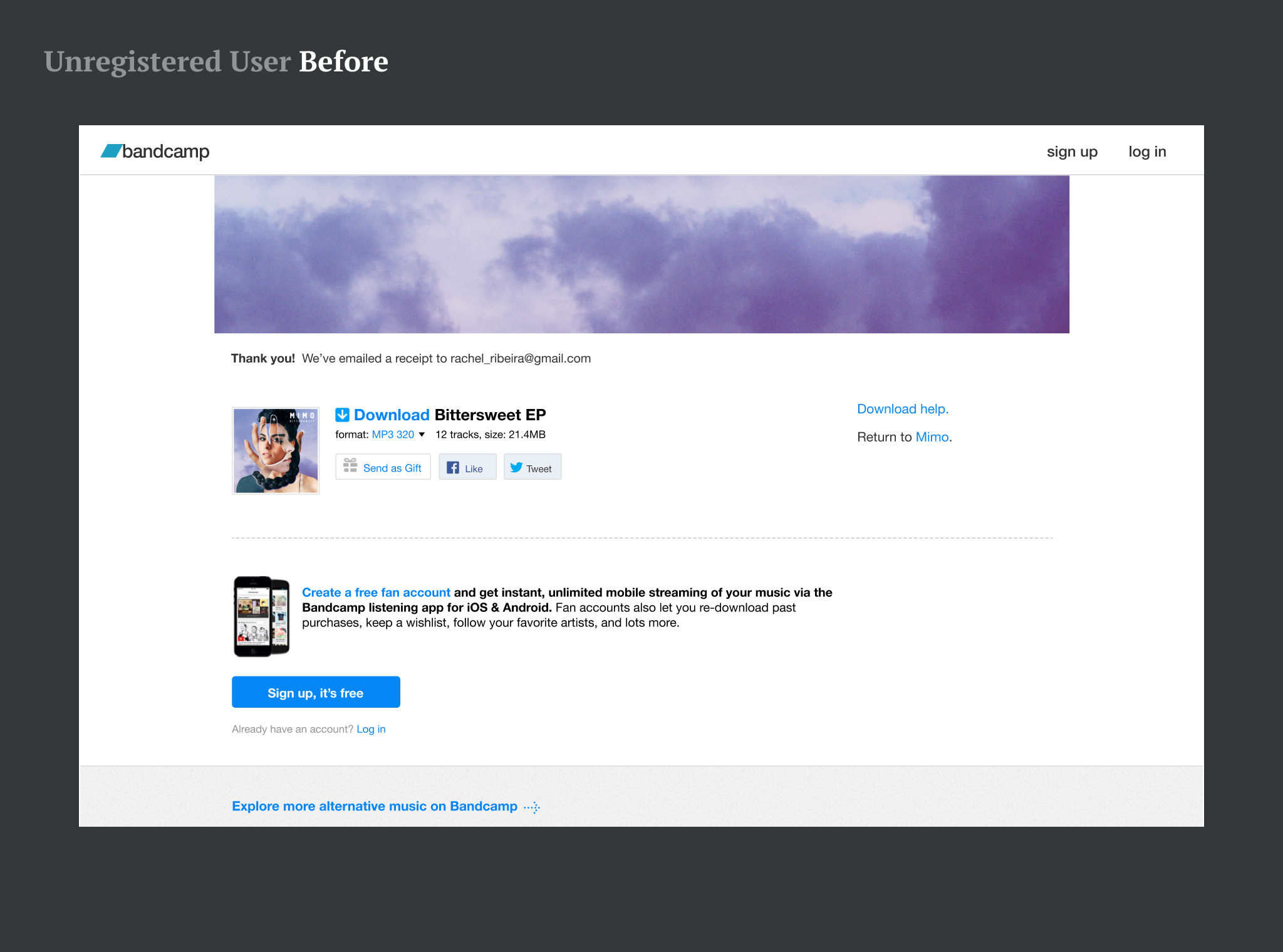
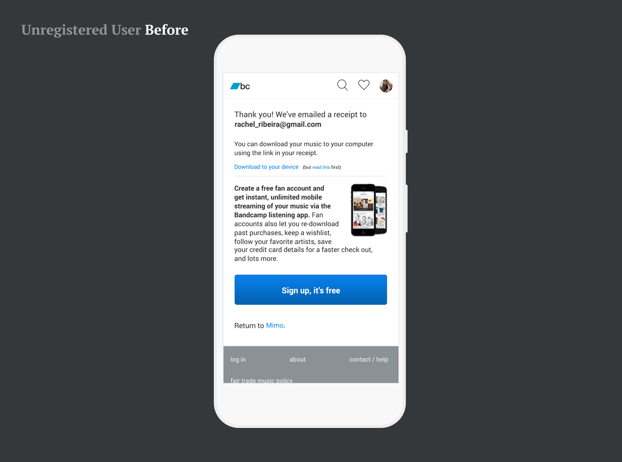
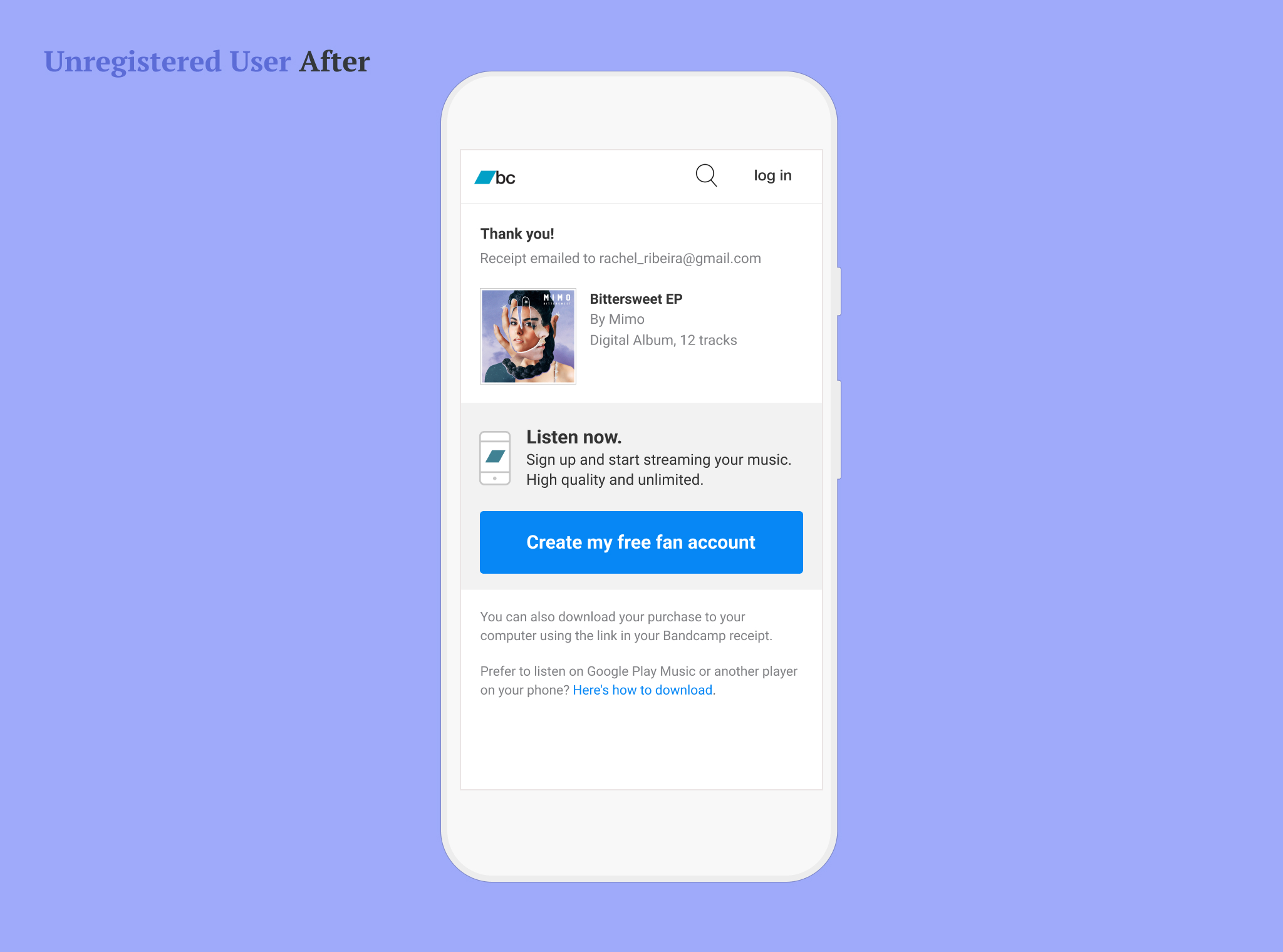
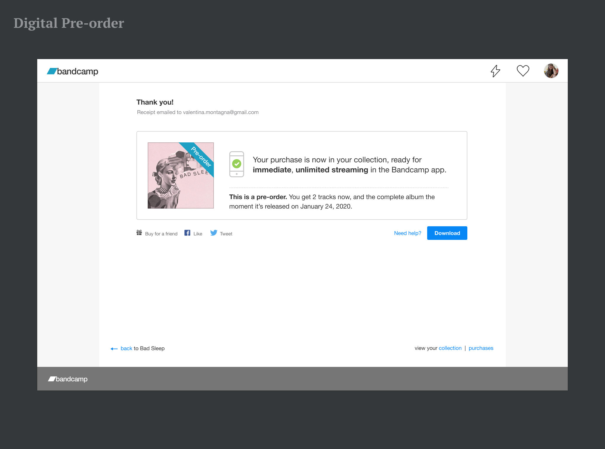
Signed up user (“Fan”) — Old vs New
It is interesting to notice how the old page was so visually unbalanced. Header and footer took over most of the space, surrounded by flat typography that did not take into account hierarchies.
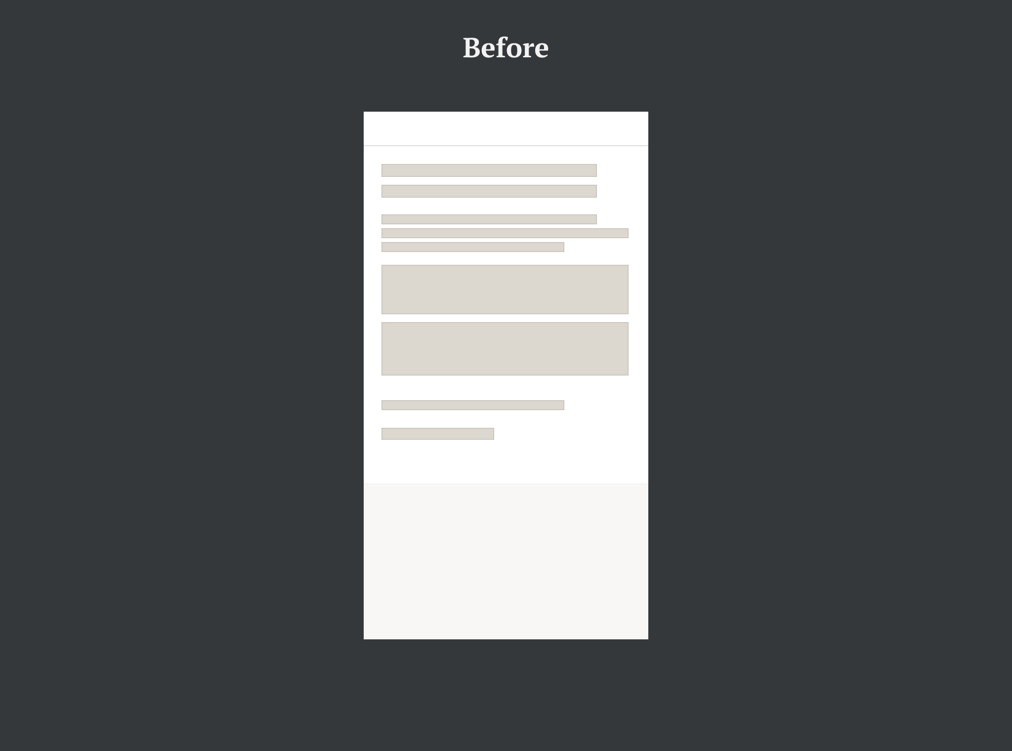
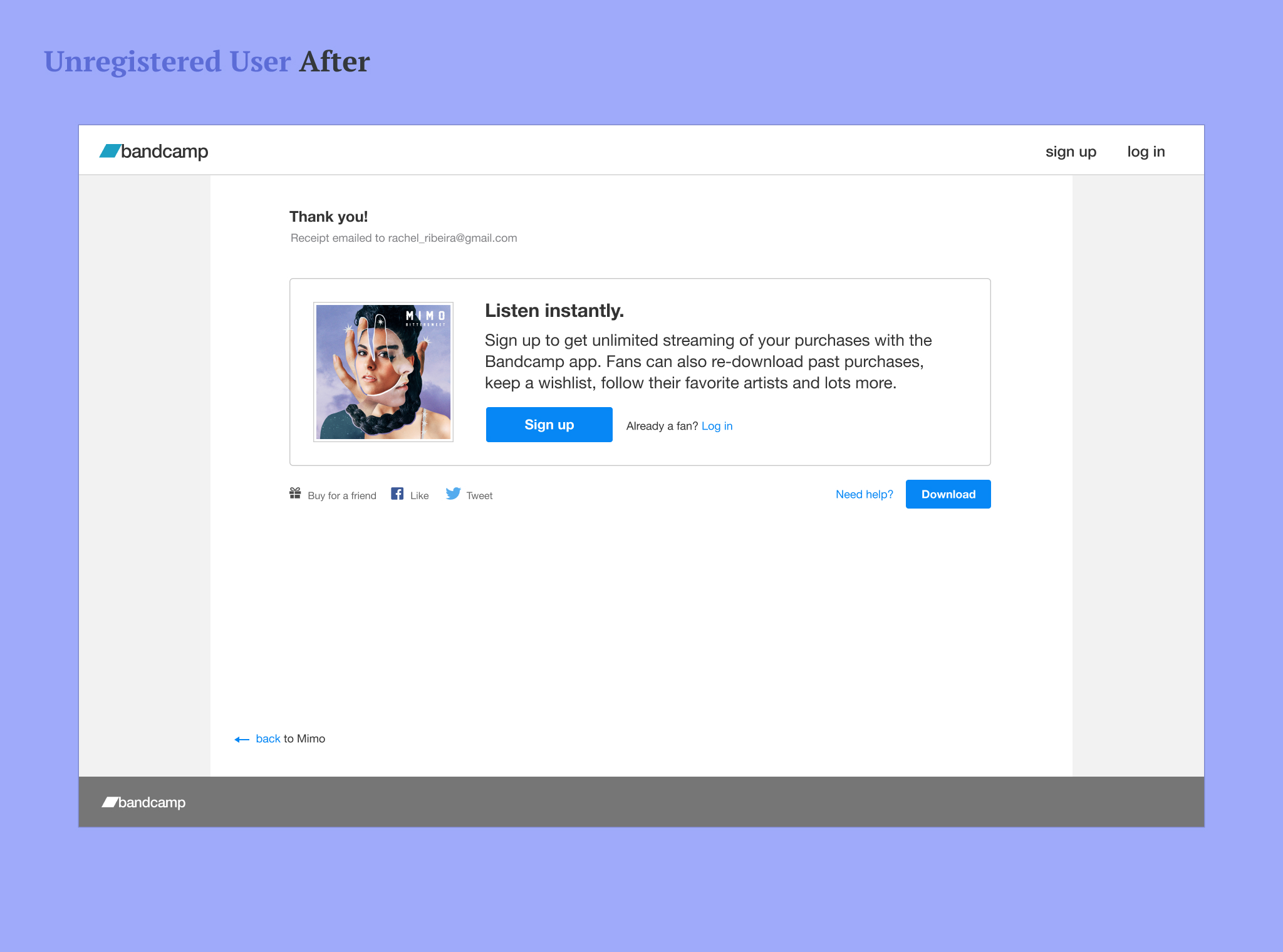
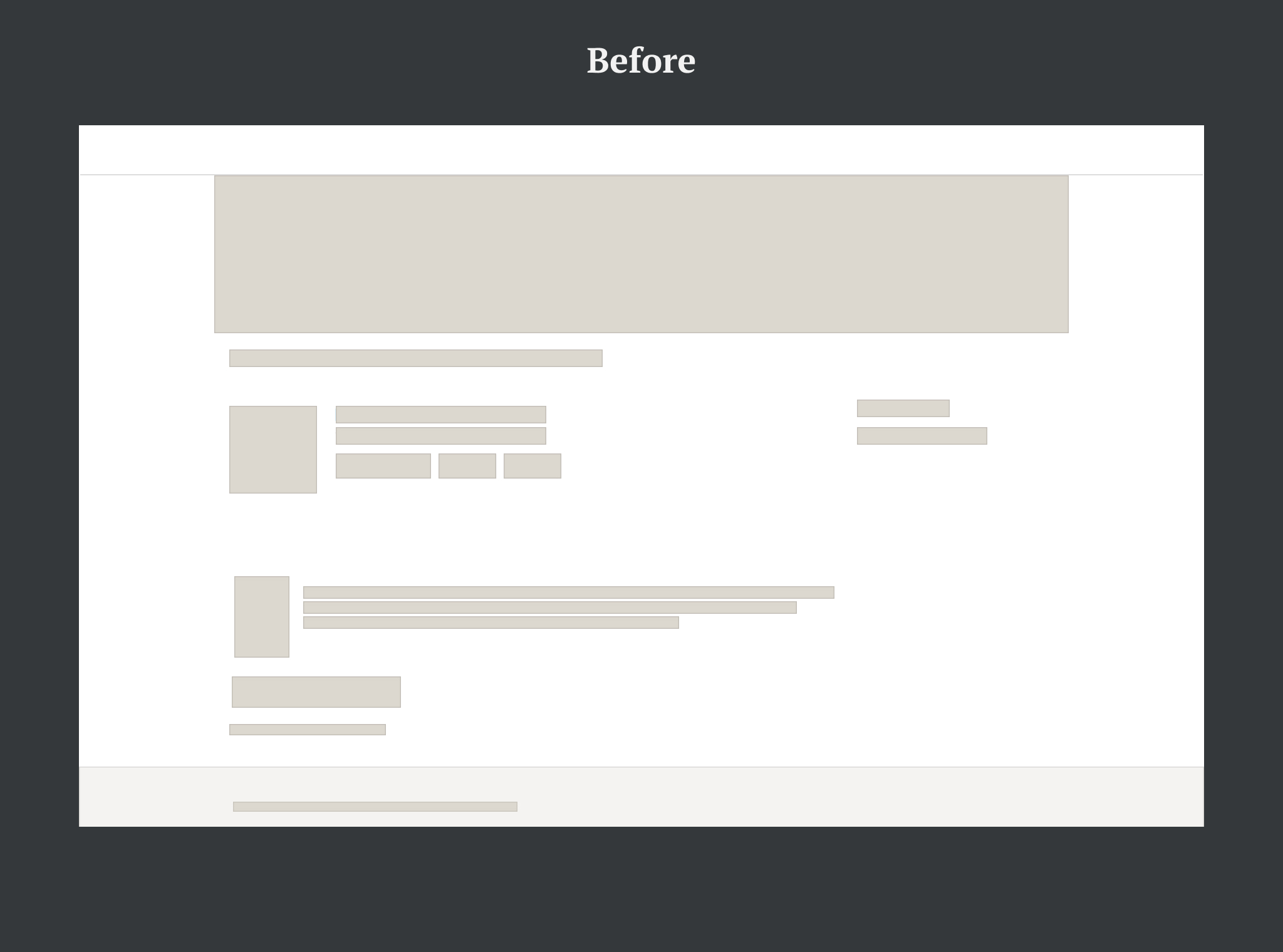
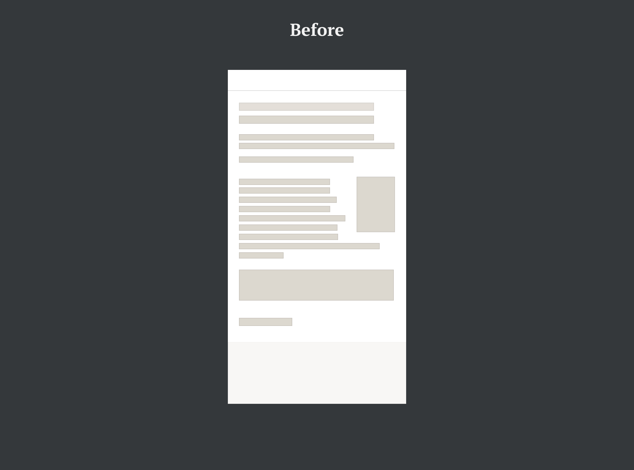
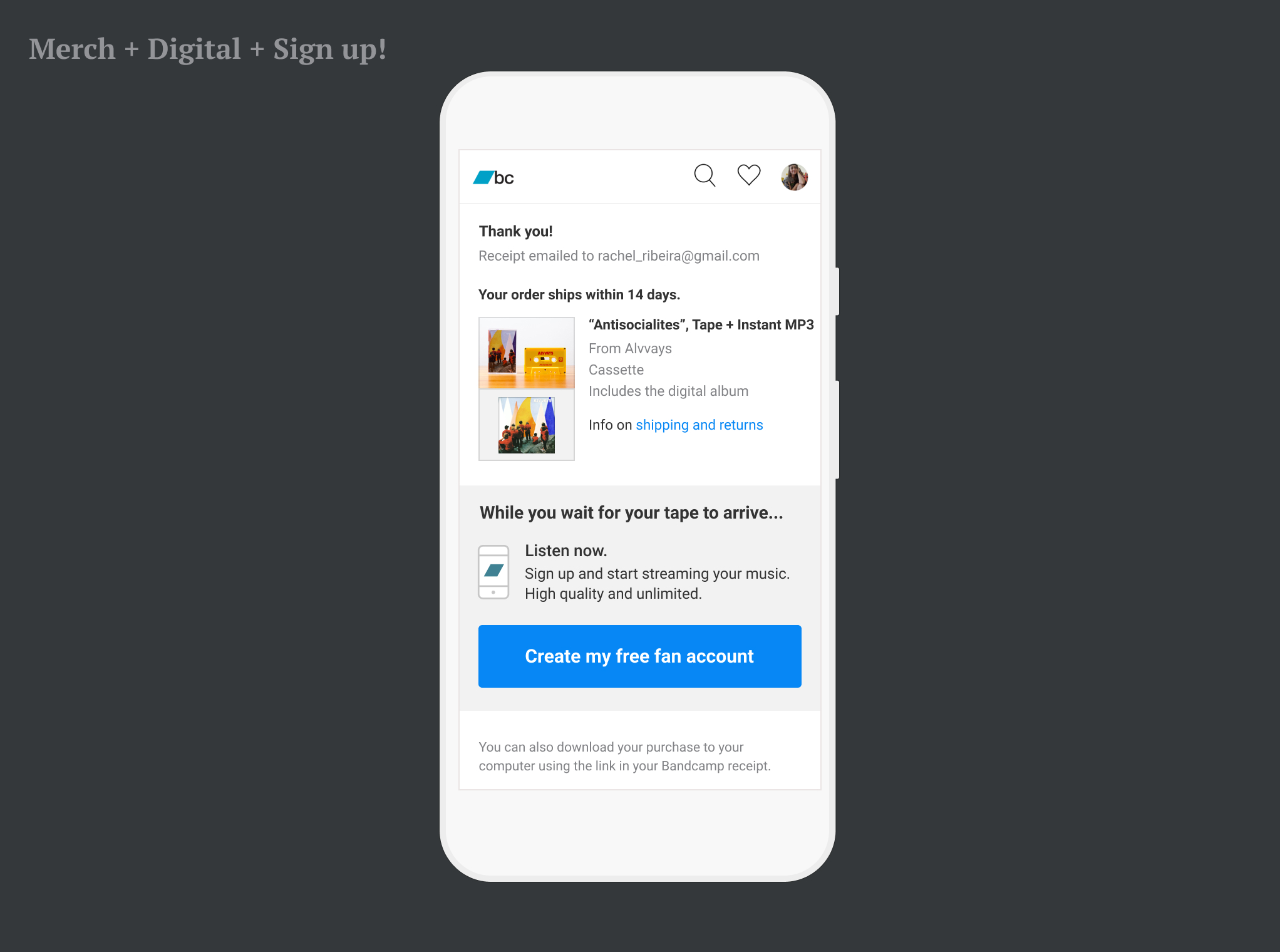
User with no account (“Non-fan”) — Old vs New
There is a fundamental shift in this version. Where the previous page includes the promo as an extra element added at the bottom of the page, the newer layout makes the sign up CTA the core message of the page.
Other Single Purchase Cases
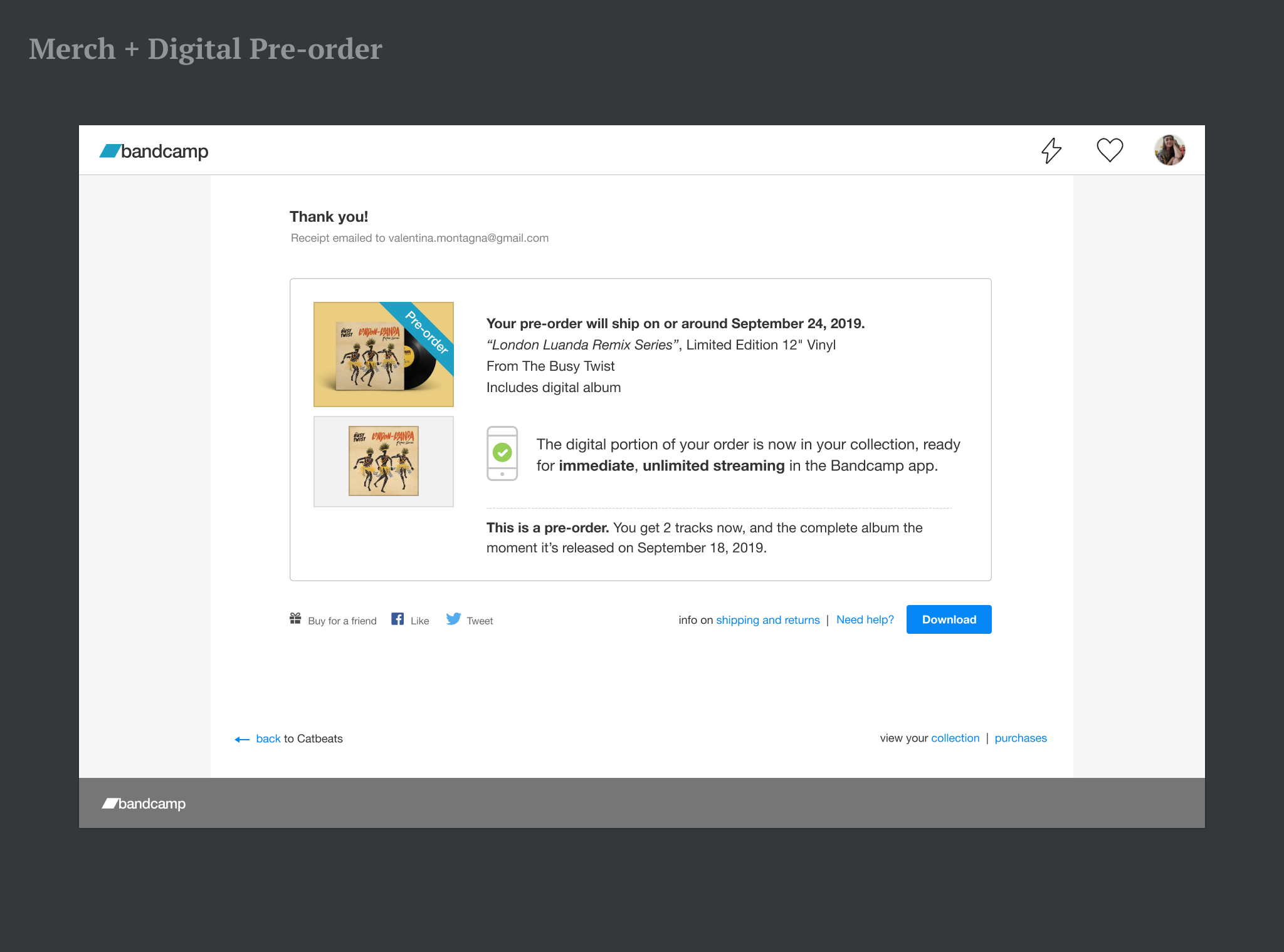
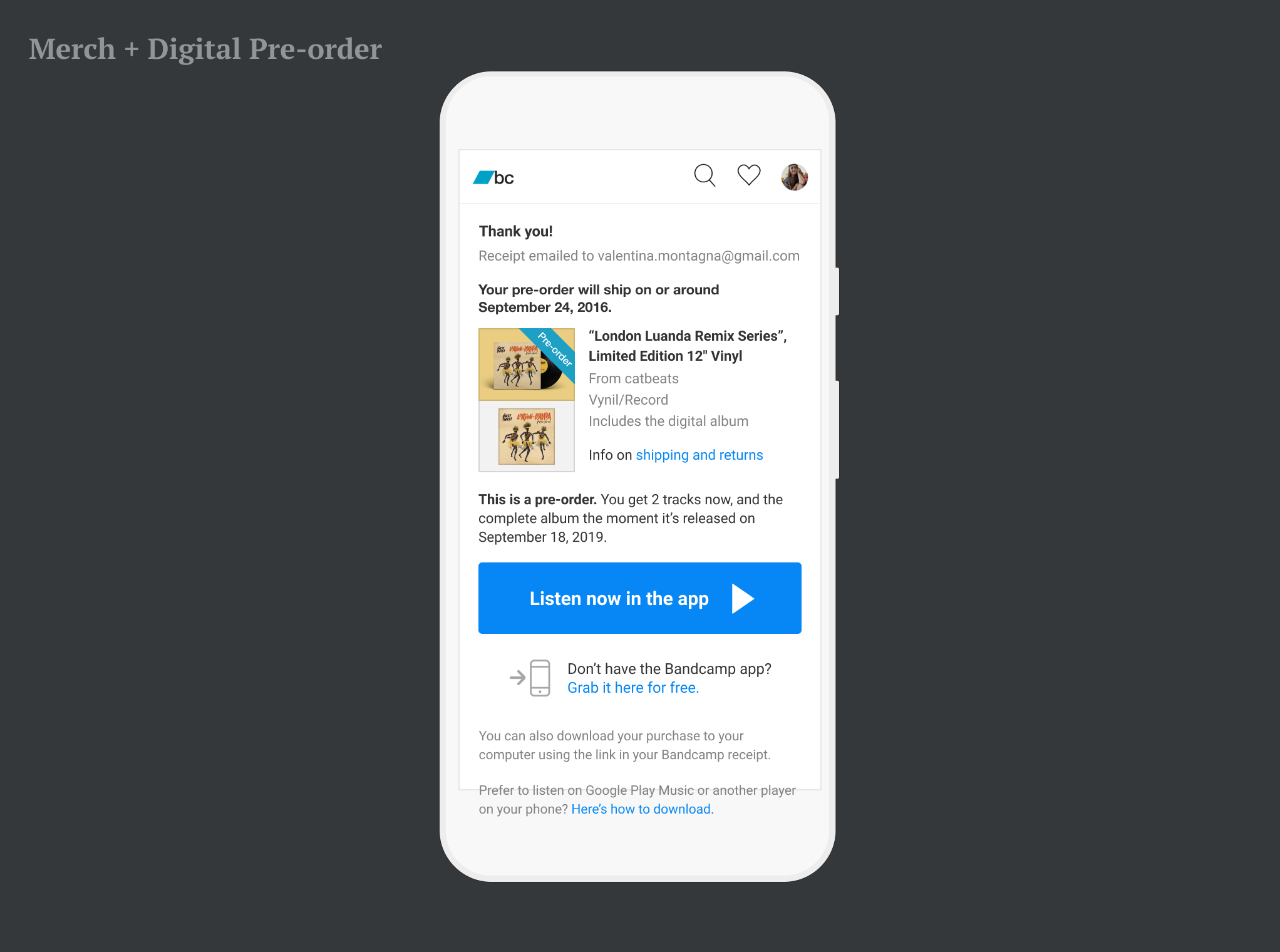
In the old layout, a graphic element was sometimes added to the thumbnail: a pre-order banner or a ribbon for gifts, for example. Cover artworks and merch thumbs had different proportions: the obvious square for covers, and 4:3 for physical items. In my re-design I methodically organized thumbs and their graphic add-ons into a visual system, ending up with 12 thumb variations.
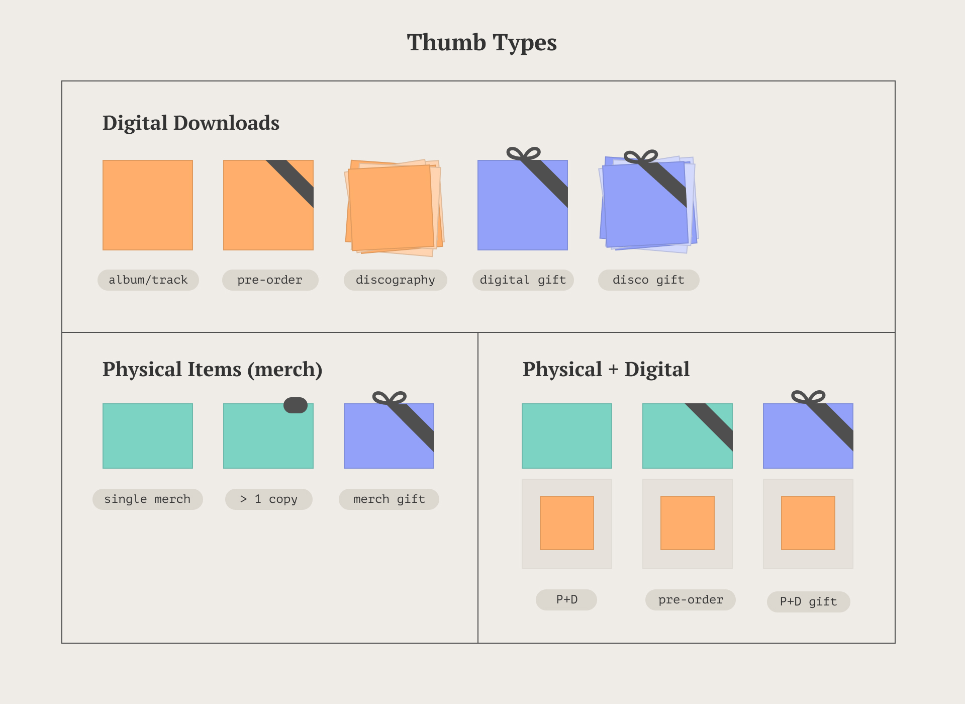
More single purchase cases. Between desktop and mobile web, there were about 30 x 2 (60) cases.
Download Options
A download is just a… download, right? Actually, downloading is not necessarily straightforward:
- On desktop, users would get to pick a format before getting their tracks in a .zip
- On mobile web, downloading was either not allowed (iOS), or confusing even for tech savy users (Android)
Desktop solution:
- On their first purchase, users would get a generic “download” button
- Format options would be grouped based on fidelity
- After choosing, the format preference was saved for the next purchase
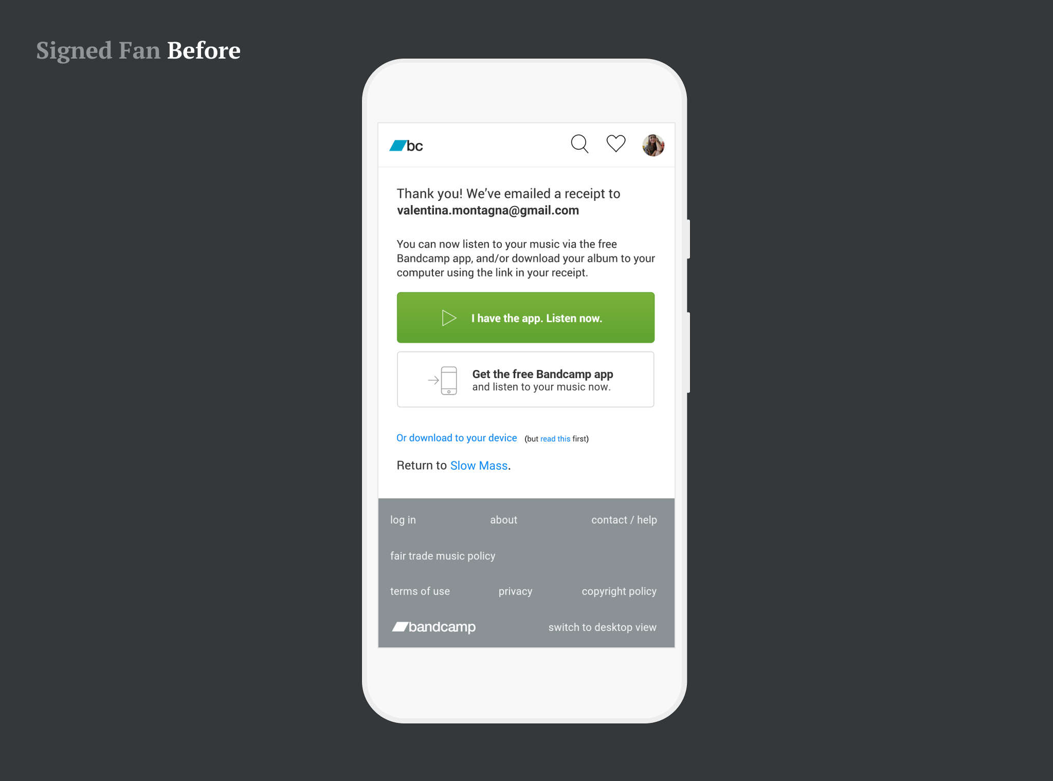
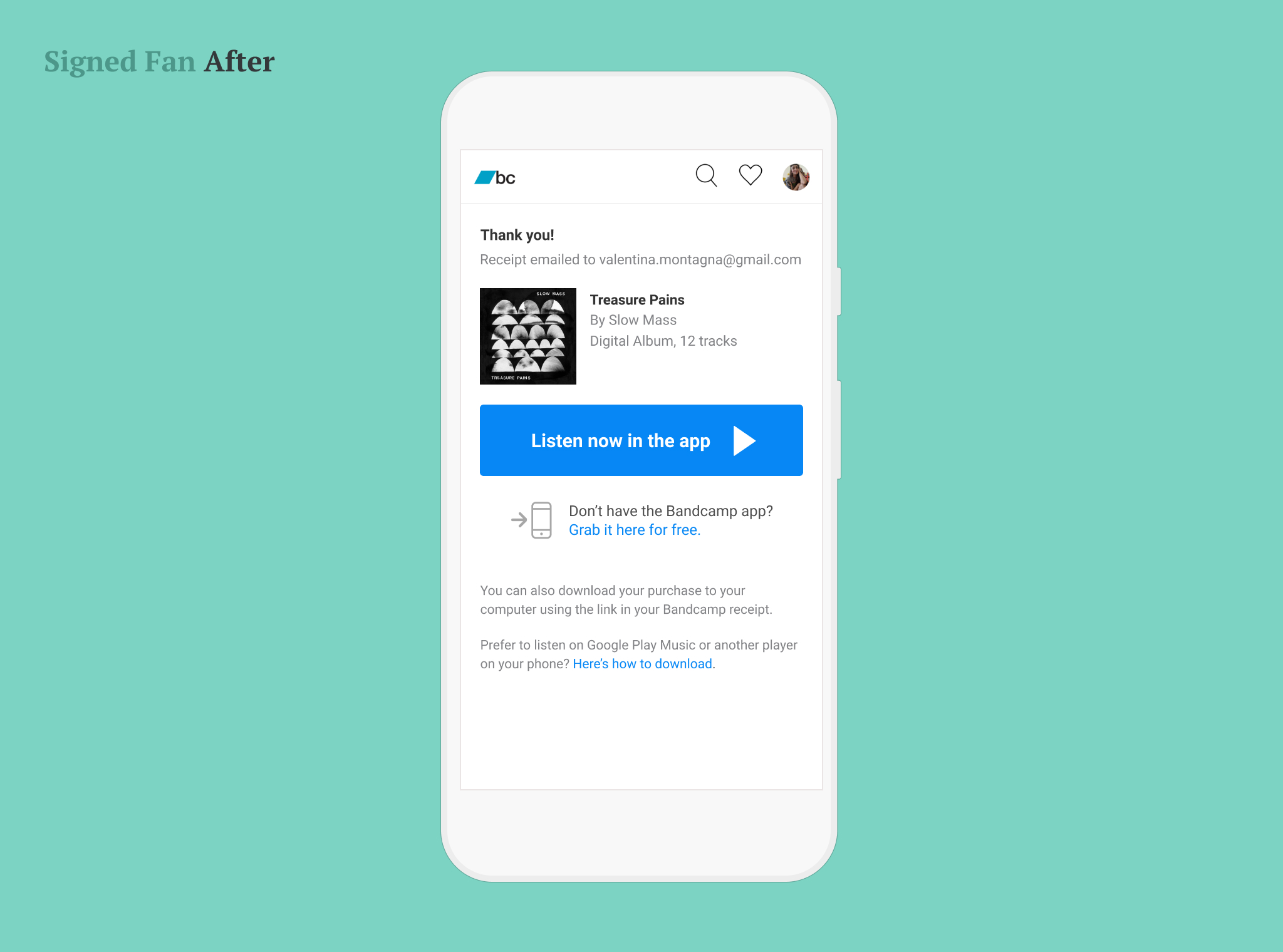
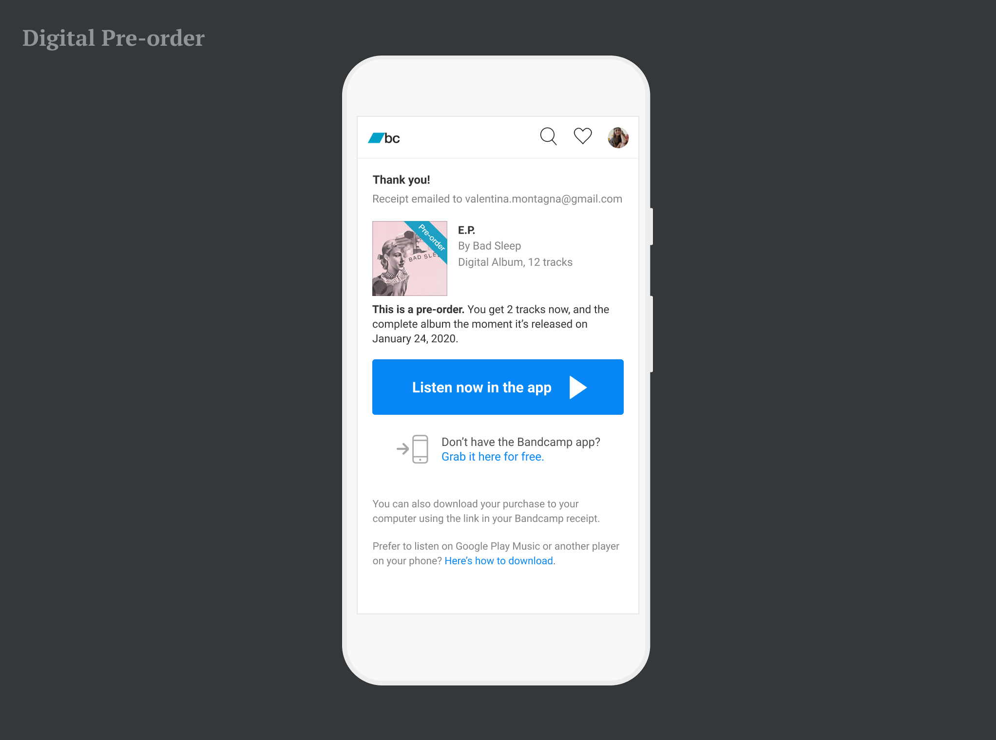
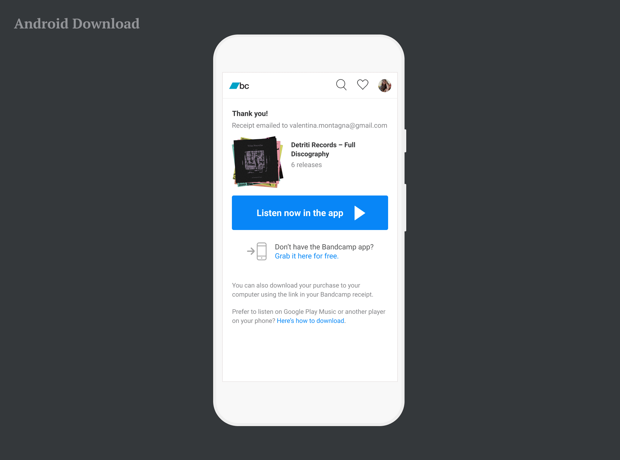
Mobile web solutions:
- With phones not reliably supporting downloads, the fastest way to listen was creating an account
- The alternative was downloading on a computer, and then transferring to the phone. With this in mind:
- I re-wrote instructions on transferring files to a phone (iOS vs Android)
- I corrected Android instruction for users who wanted to try downloading anyway
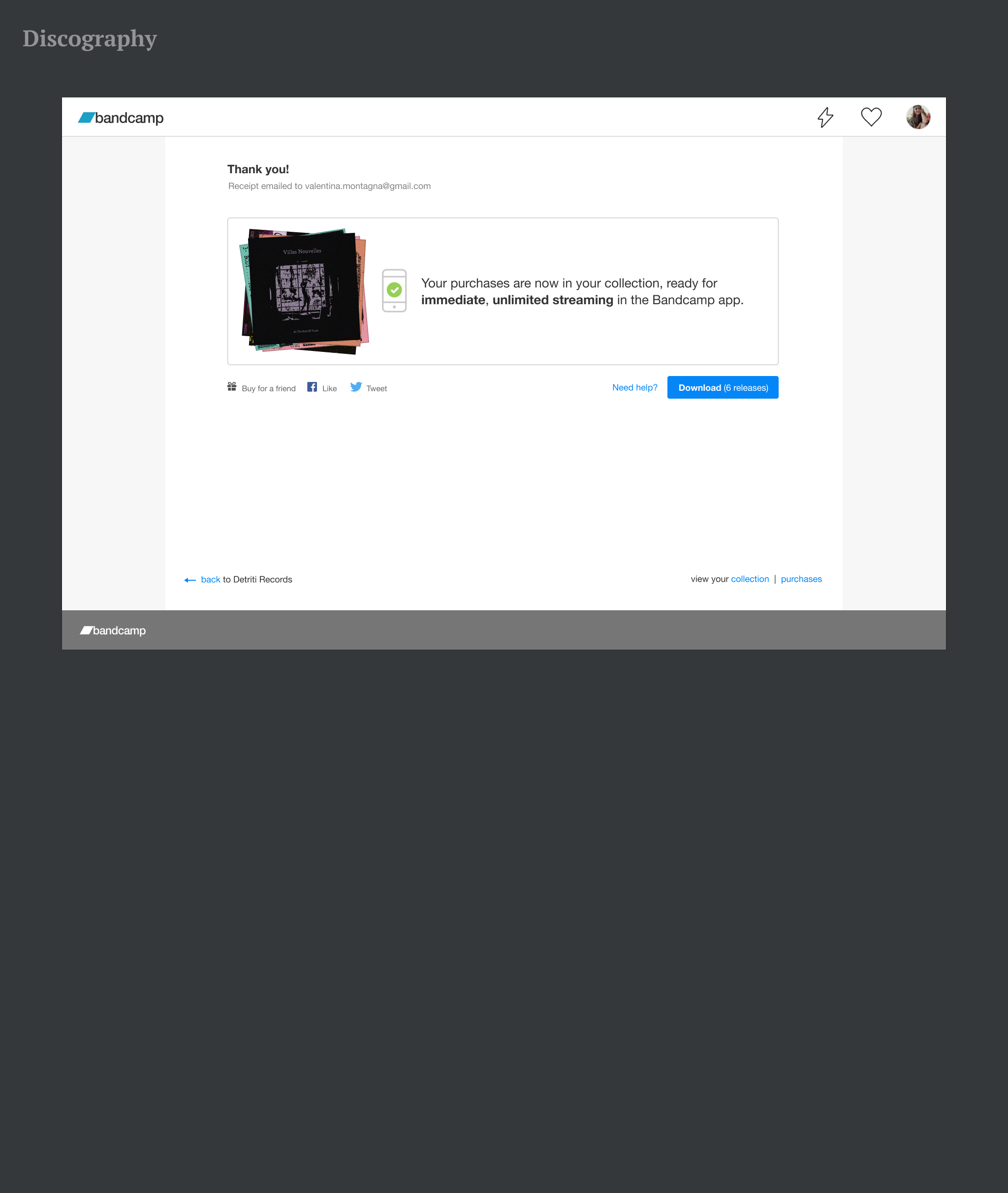
Single purchase, but multiple downloads
The last case was the Full Discography, a package including multiple downloads. Visually, this layout took me a step closer to solving carts, with a solution for a purchase including more than one digital item and the corresponding downloads. In fact, a discography was offered as a series of releases, which would have to be downloaded separately.
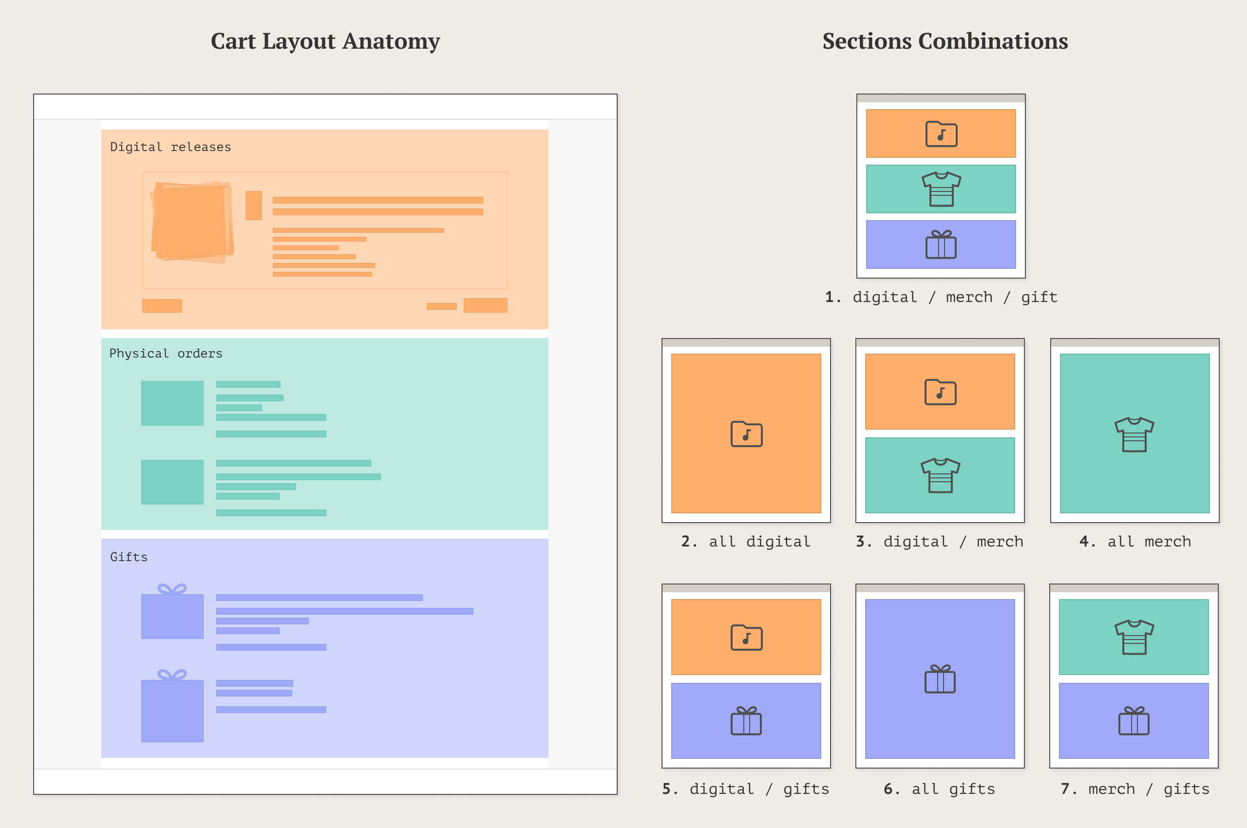
Multiple Purchases: Carts
To make sense of carts, I went back thinking on the item’s type. Instead of grouping items by digital vs physical vs digital+physical, I defined similarities by looking at what was the primary need. What did I know that could help me categorize the different items in a cart?
- Digital items would all be available for streaming. The message was the same.
- Digital items would come with a download (taking me back to the discography’s layout).
- Merch items had an estimated delivery time, and possibly options for size/color/quantity.
- On the buyer’s side, gifts never had a download, but would mention the email and physical address of the giftee.
With this in mind I ended up with a page with three sections:
- Digital releases: similar to a discography, with a button toggling the full list of downloads.
- Physical orders: listing only ETAs and other meaningful info.
- Gifts: both digital and physical.
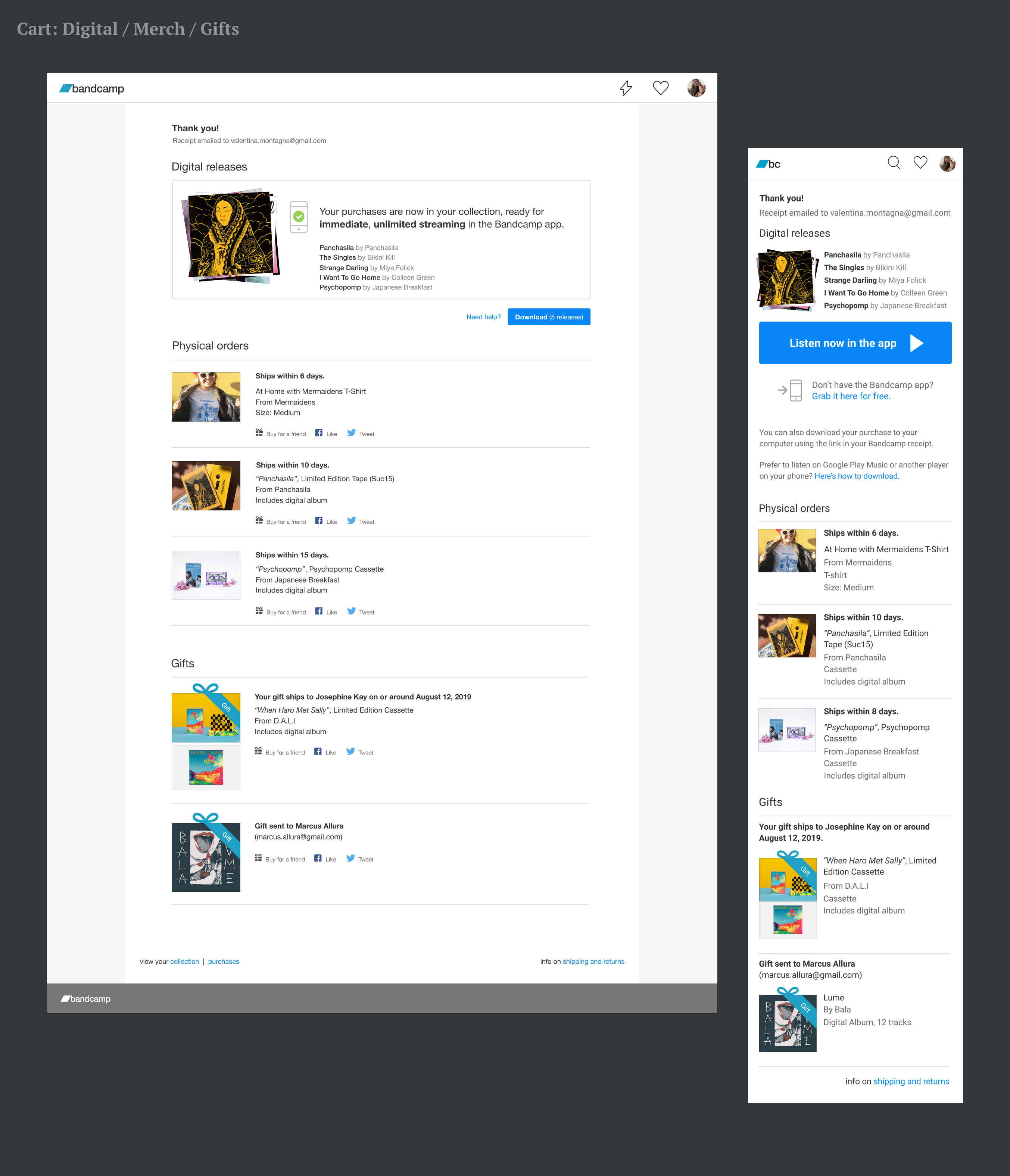
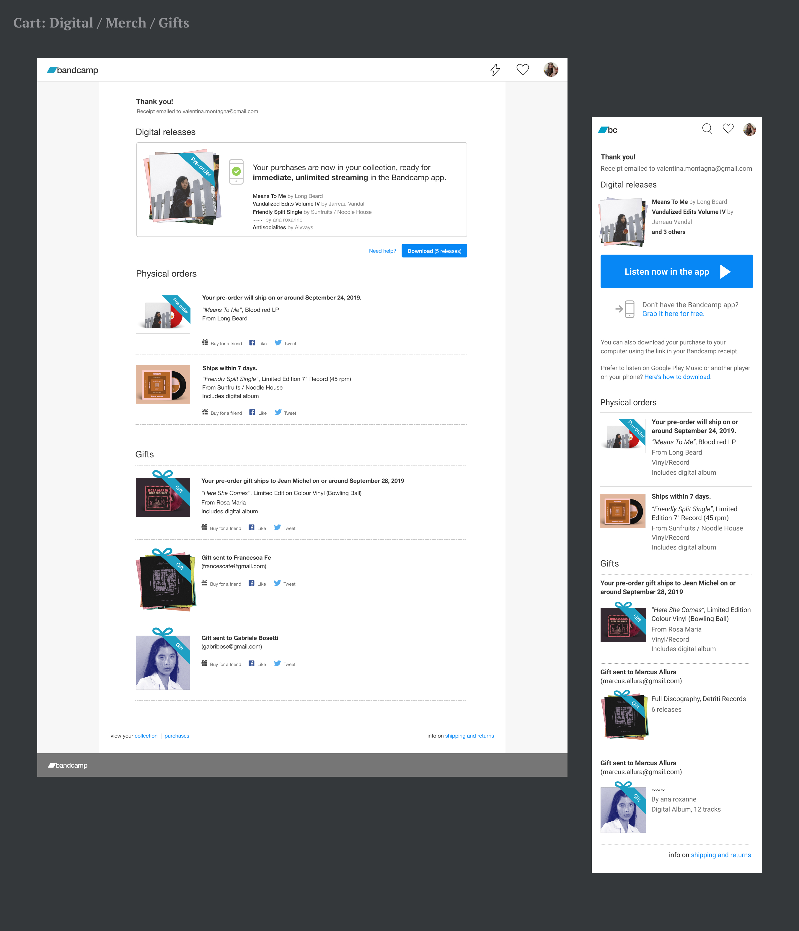
In the final cart design, all the possible cart combinations would generate only 6 layouts.
Cart purchase with digital, merch, and gifts. Physical orders and gifts are essentially the same on both platform. The real difference is with the digital component.
Conclusions
- After the launch we recorderd a significant increase in app installs
- As of today, the PPP remains the first place fans get to know about our apps
- Later we introduced two other types of items for purchase, without changing anything in this design
- On the other hand… desktop users wanted to see the download first. The streaming message was important communication for us, but not a priority for fans. The plan is to go back and reexamine the issue, honoring real users’ needs first.